Overview
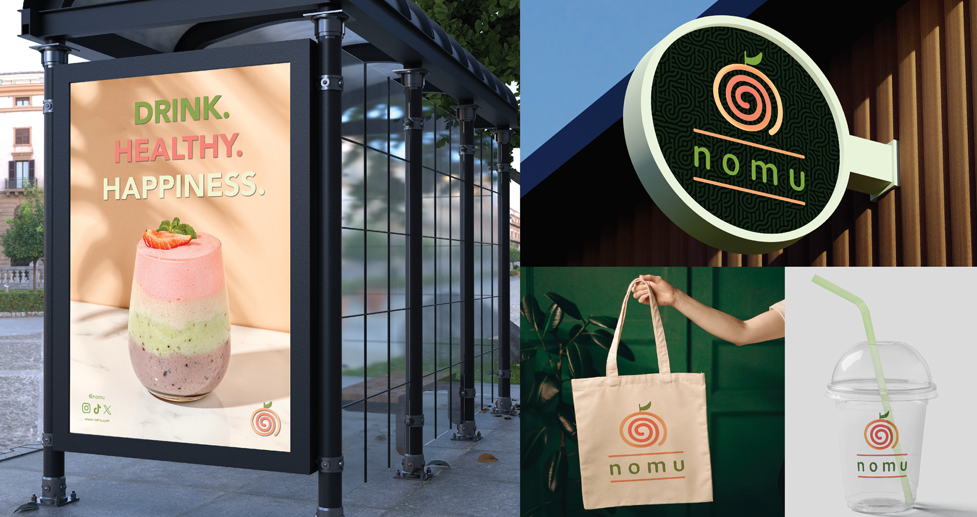
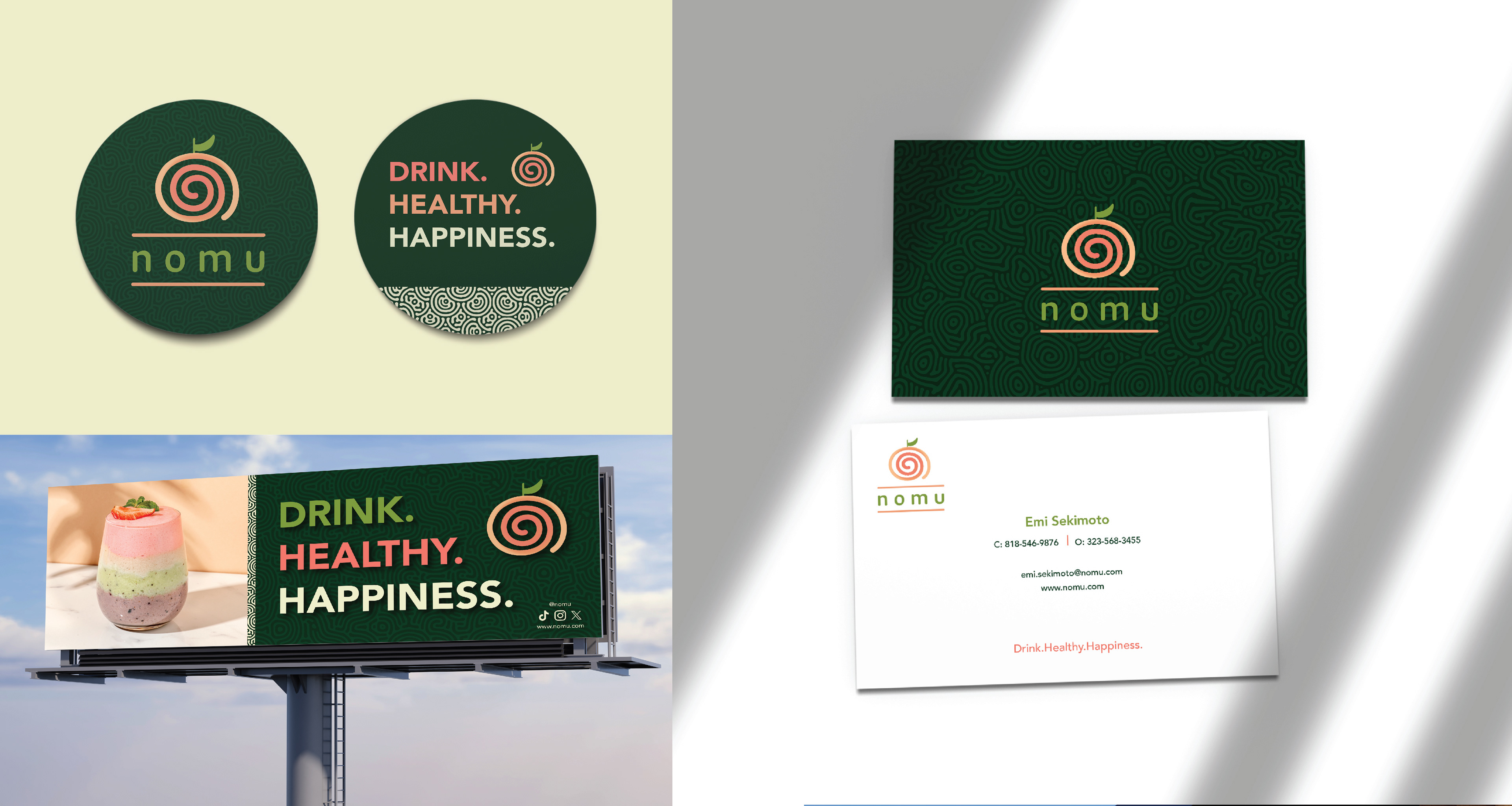
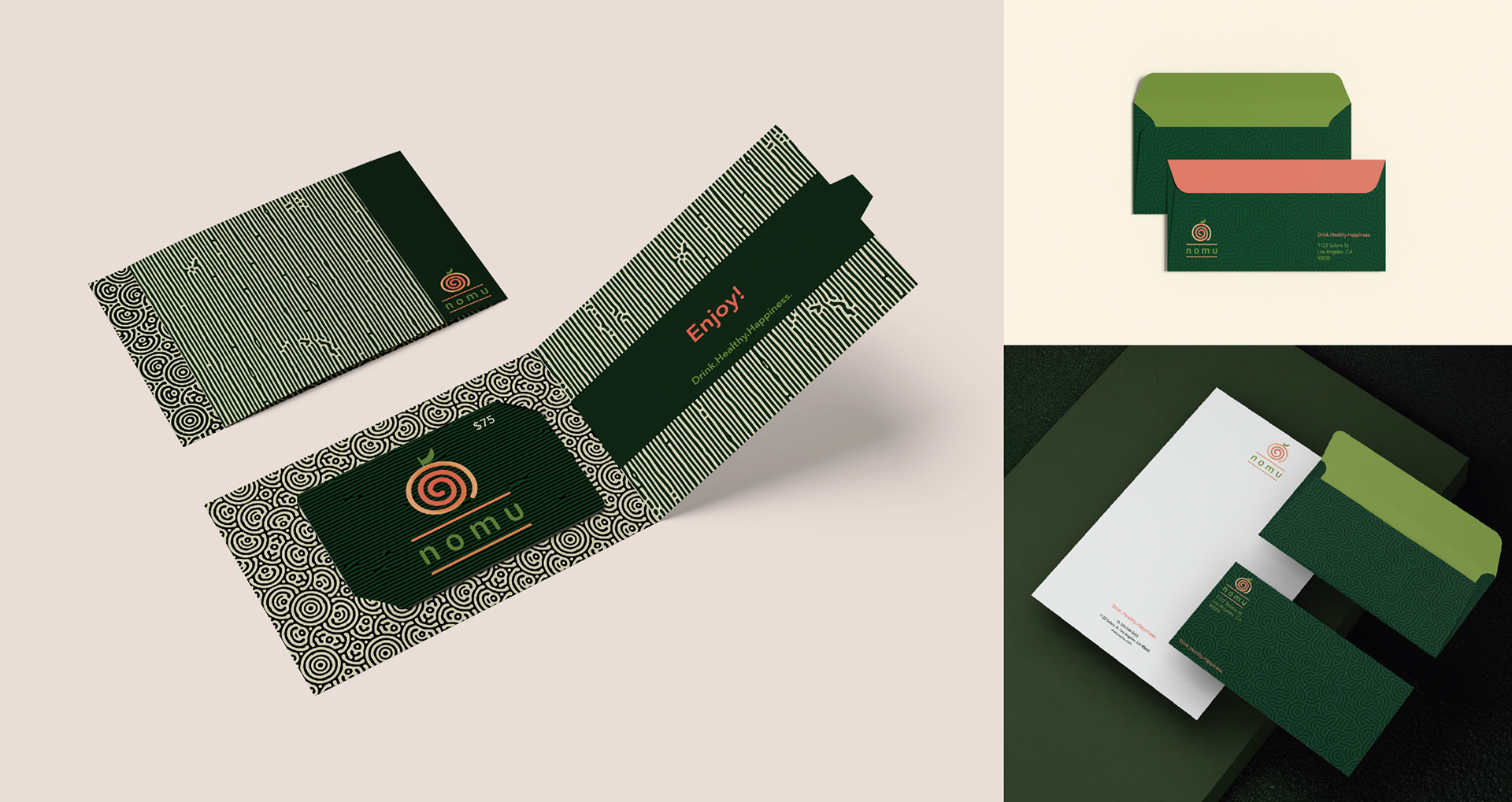
The goal of this project is to establish a cohesive, modern, and visually compelling brand identity for "nomu," a new smoothie brand focused on health, sustainability and vibrant flavors. The visual identity reflect's the brand's core values: freshness, natural ingredients, wellness, and fun
Process Work
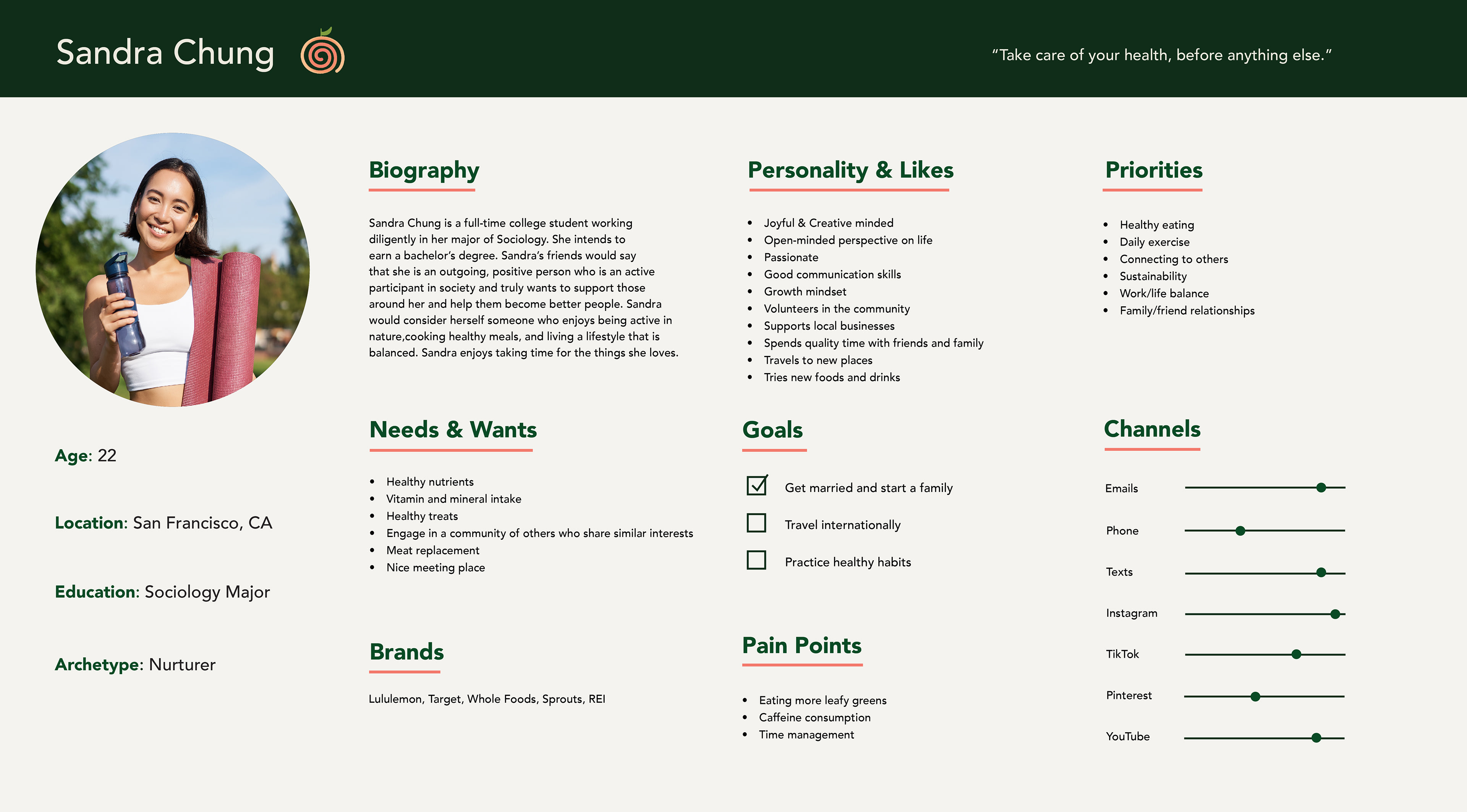
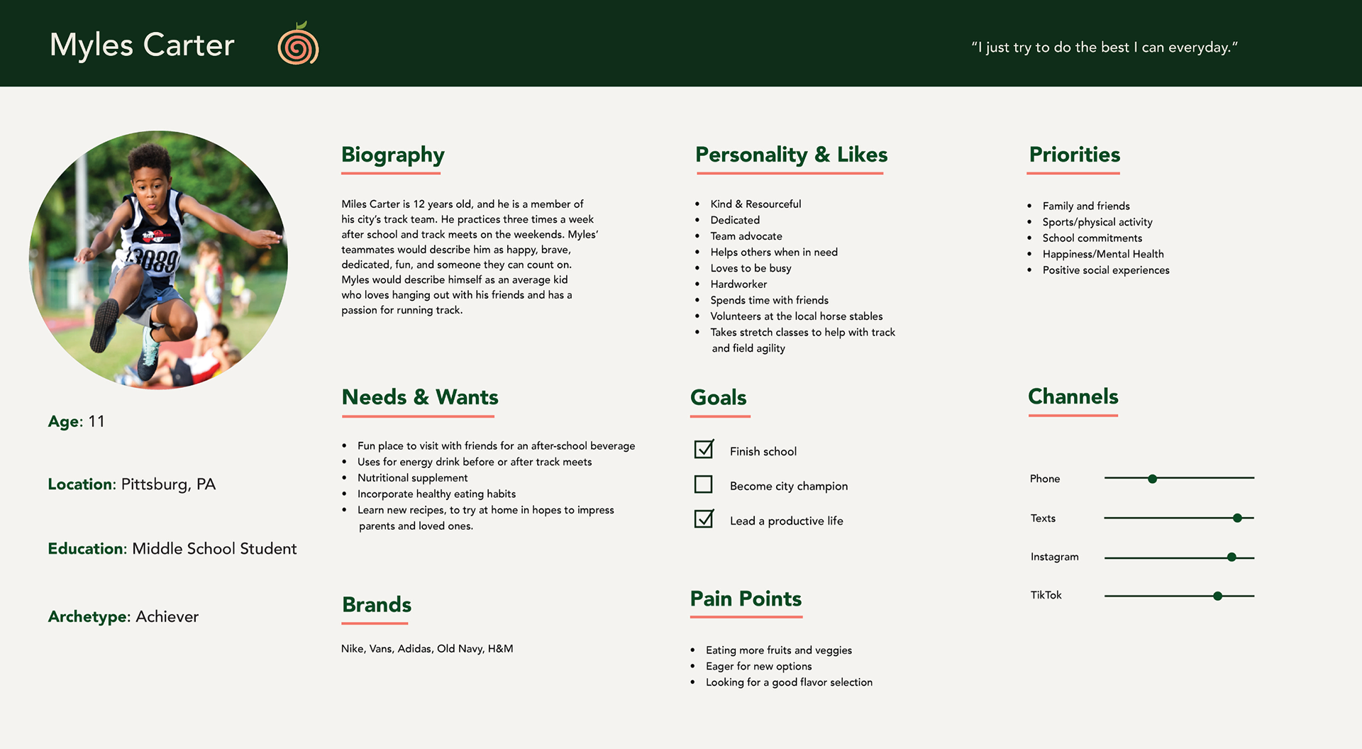
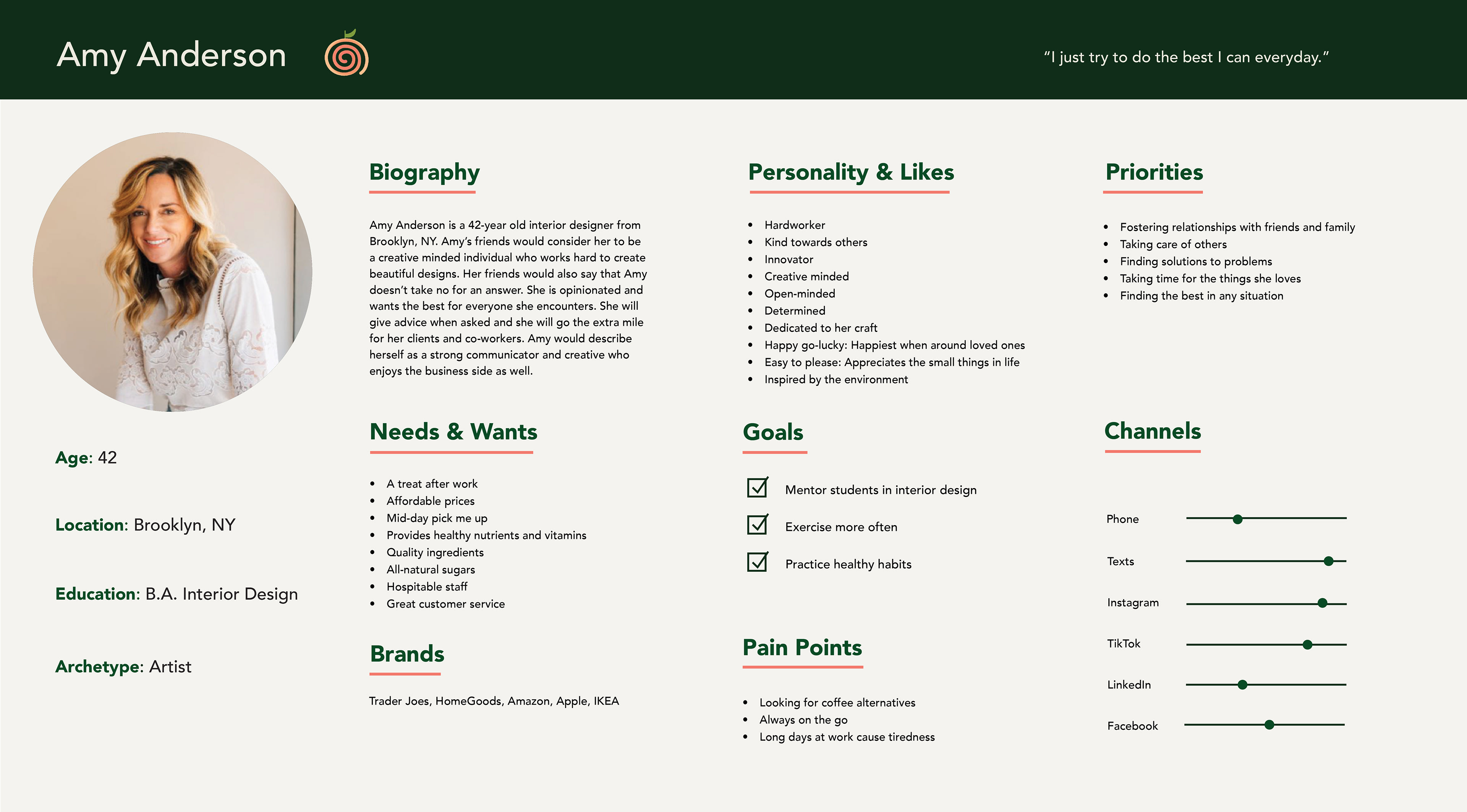
Persona Profiles
Nomu is designed to appeal to a wide demographic, ranging from pre-teens to early-aged adults. While this audience spans various life stages, they share key values that drive their purchasing decisions, particularly a growing awareness of health, lifestyle branding, and convenience. In today's fast-paced world, consumers are increasingly seeking products that support their wellness goals without sacrificing taste or ease of use.
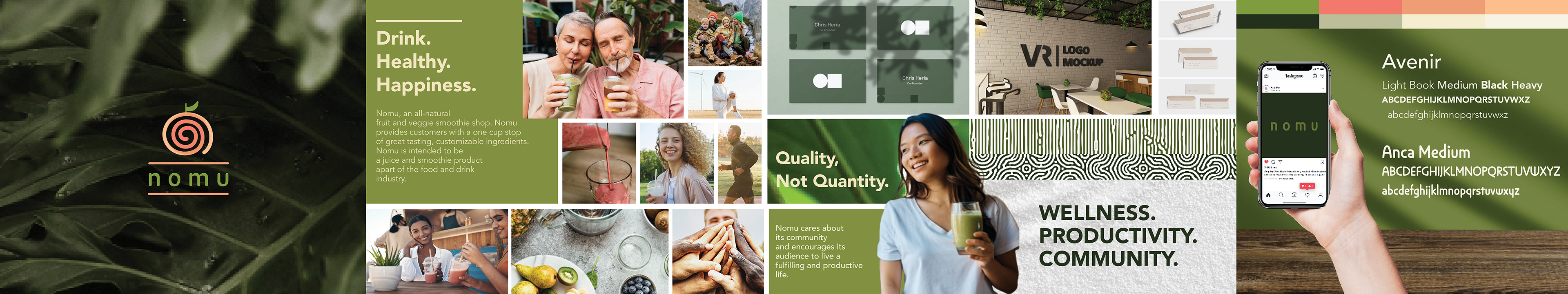
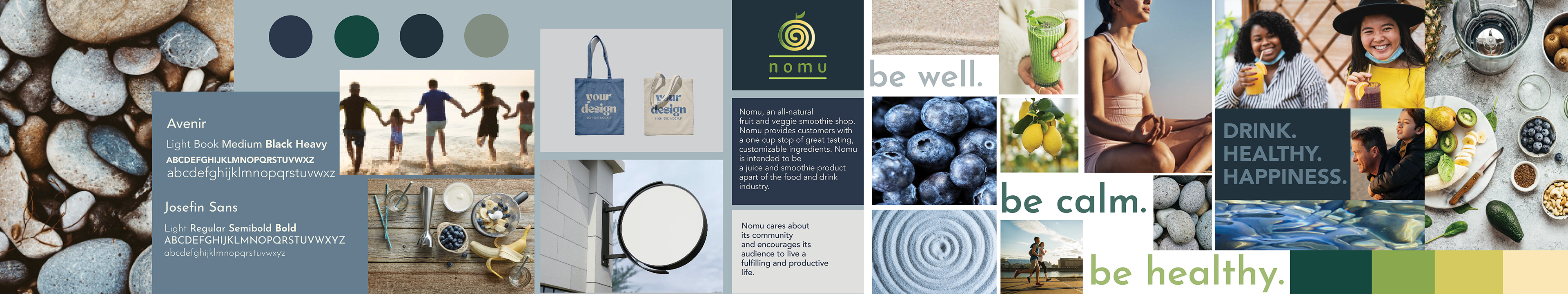
Stylescapes
The green color scheme in Storyboard #1 reflects nomu’s deep connection to nature, freshness, and vitality. It evokes a sense of calm for both body and mind, supported by balanced, clean ingredients. Styleboard #2 channels the calm energy of the coast a blend of cool blues, soft greens, and natural textures that evoke ocean air, smooth stones, and sunlit shores. There’s a quiet vibrancy in the palette, where freshness meets serenity. It reflects a lifestyle that’s both invigorating and grounded
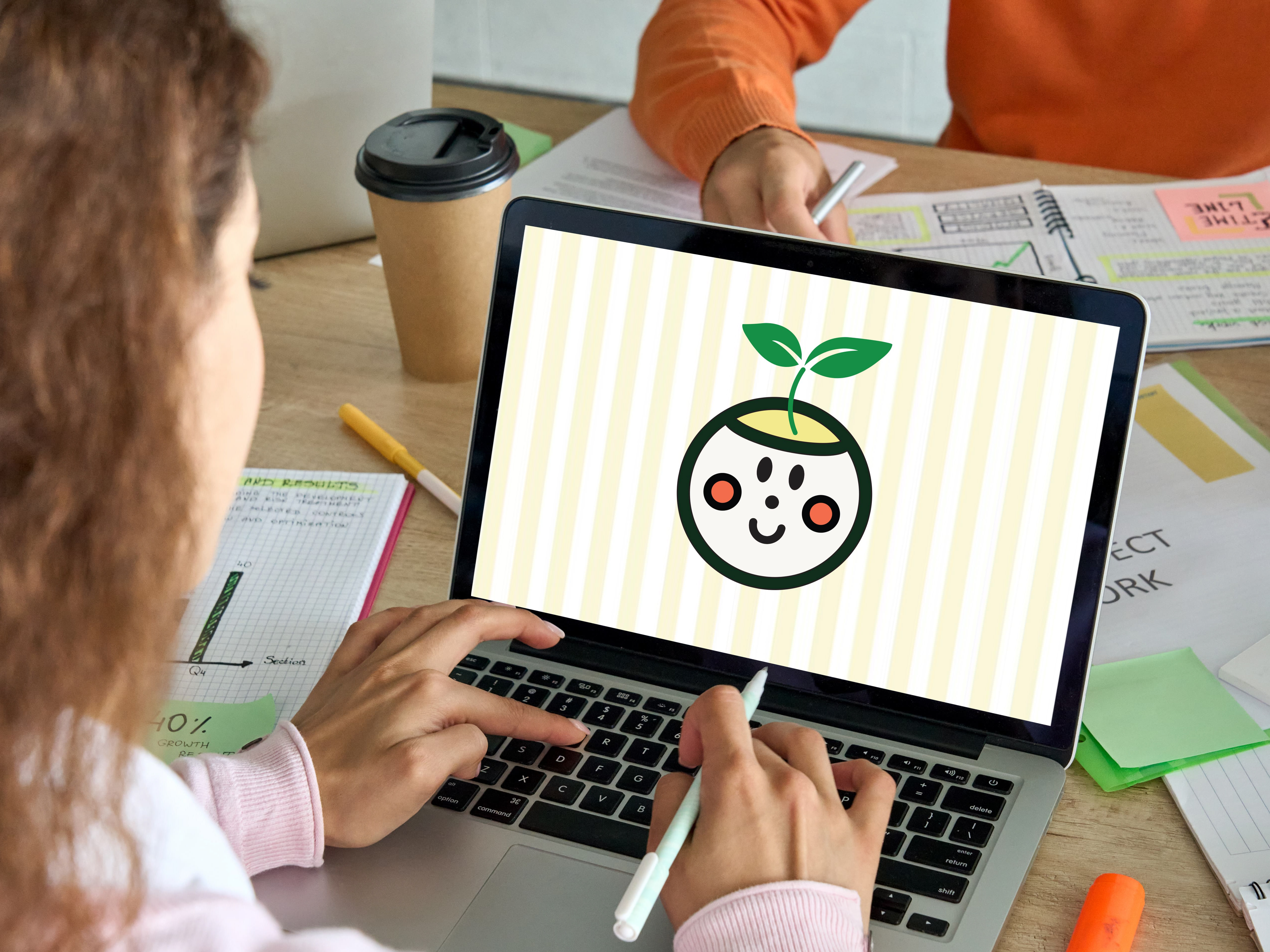
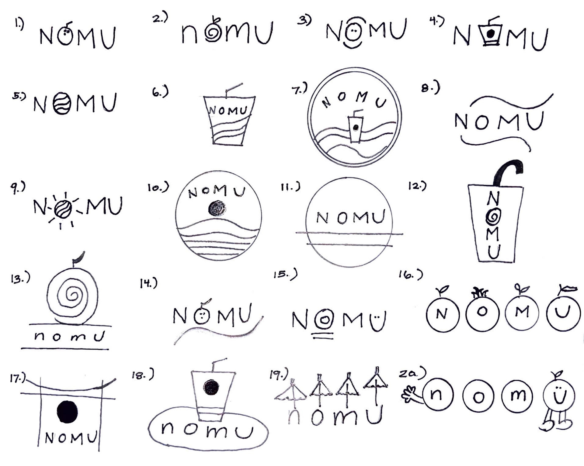
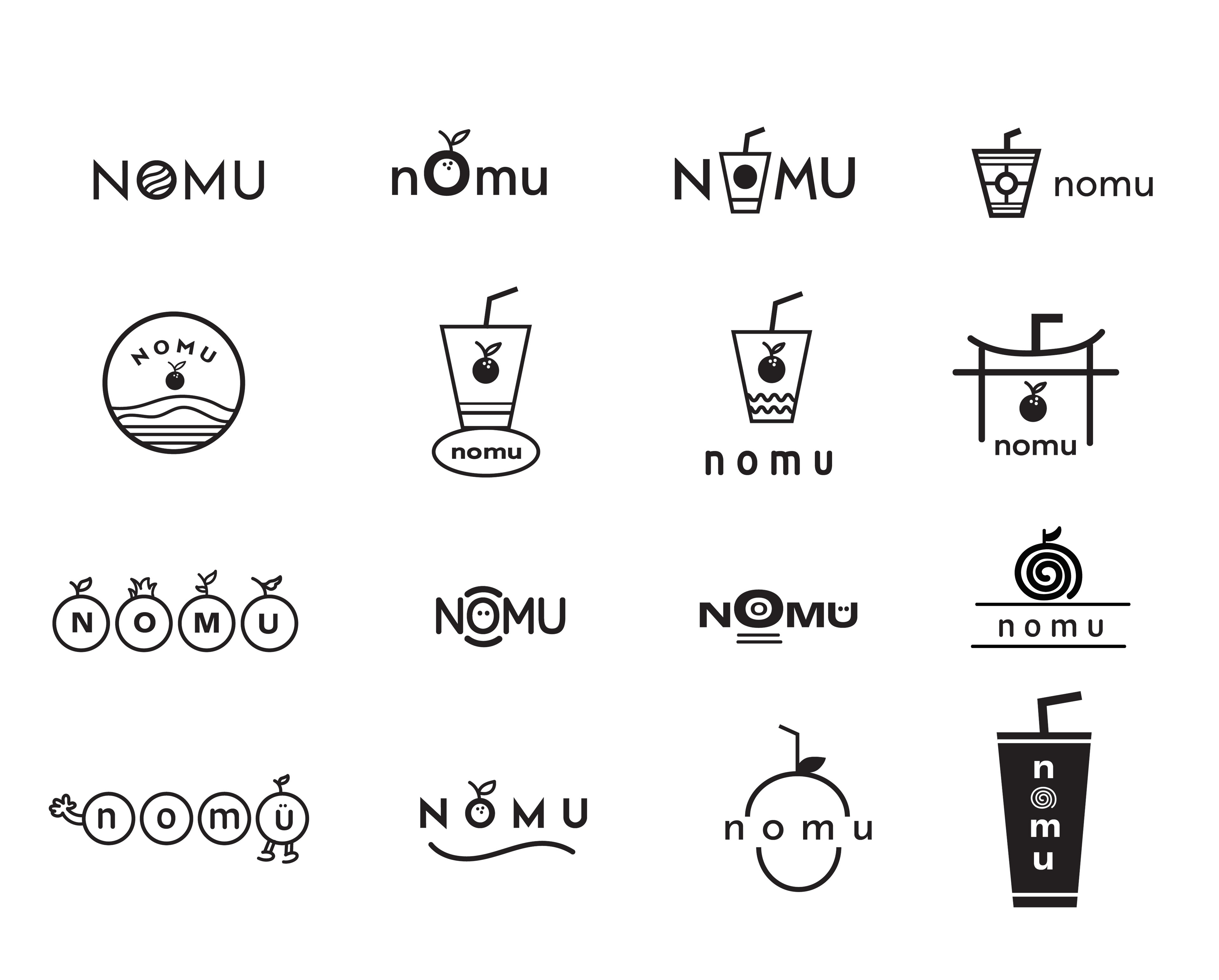
Brand Mark Process
When designing the nomu logo, I was guided by a few key ideas. First, I wanted the typeface to reflect a zen, minimalist aesthetic with subtle Japanese influences. Second, the imagery needed to remain clean and simple while clearly representing the brand’s smoothie-focused identity. I explored several concepts — from fruit illustrations and smoothie cups to a charming character icon and abstract line work.
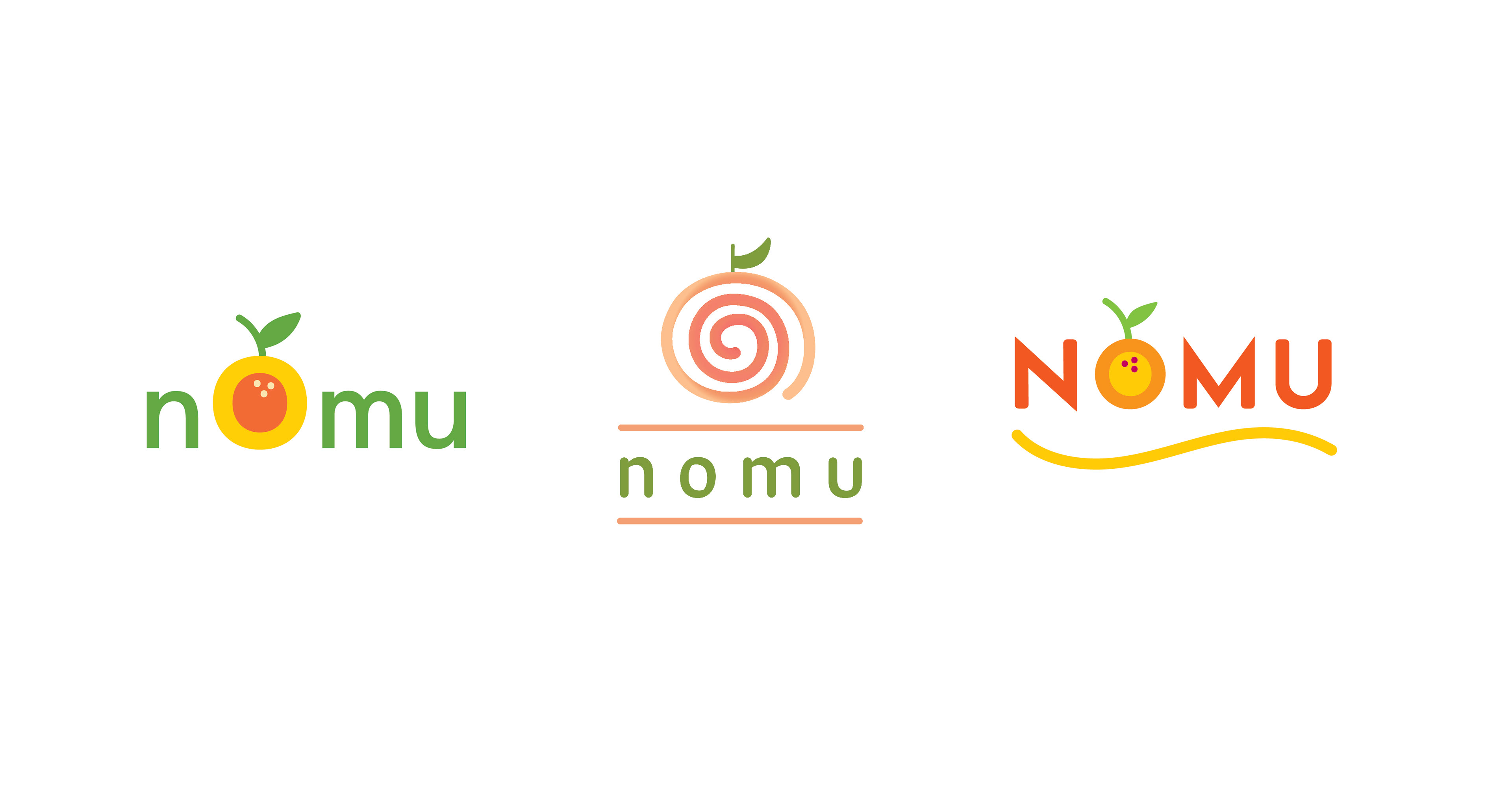
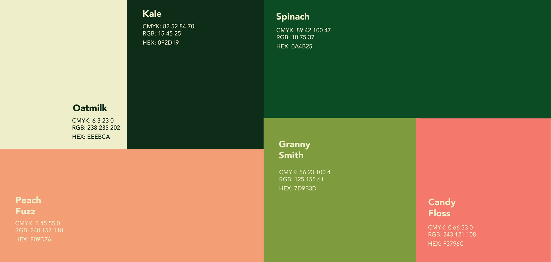
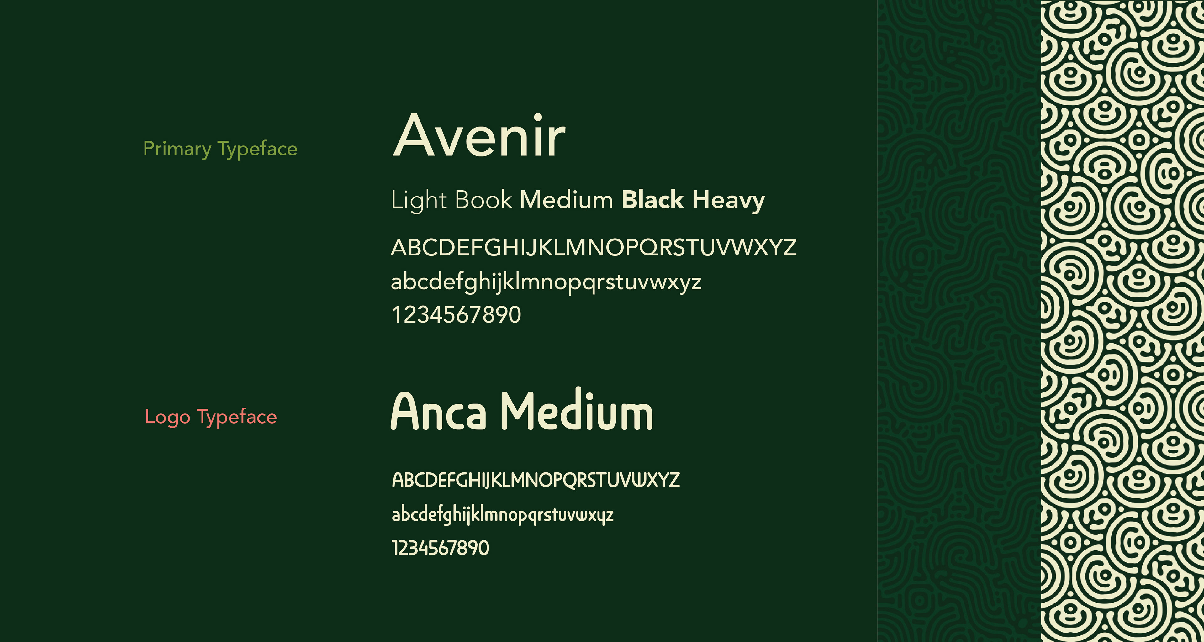
Color Palette & Typography
The green, pink, and cream color palette reflects the essence of a zen-inspired smoothie brand — calm, refreshing, and naturally balanced. Green symbolizes vitality, wellness, and the connection to nature at the heart of nomu. Soft pink adds a gentle touch of warmth and playfulness, evoking feelings of comfort and self-care. Cream grounds the palette with a sense of softness and simplicity, reinforcing the brand’s minimal, mindful approach. Together, these colors create a serene yet vibrant visual identity that mirrors the nourishing, intentional experience of every nomu smoothie.