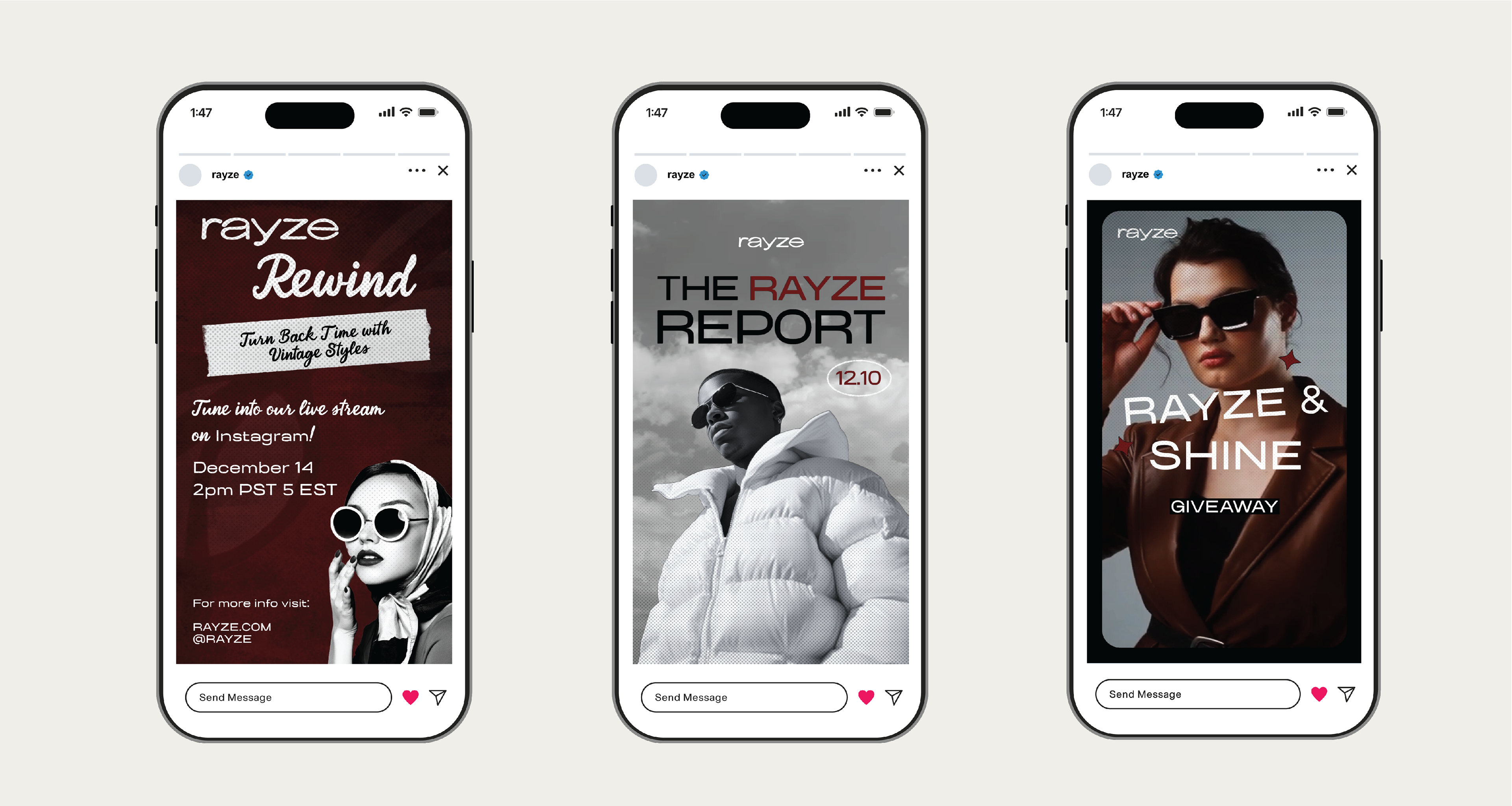
Overview
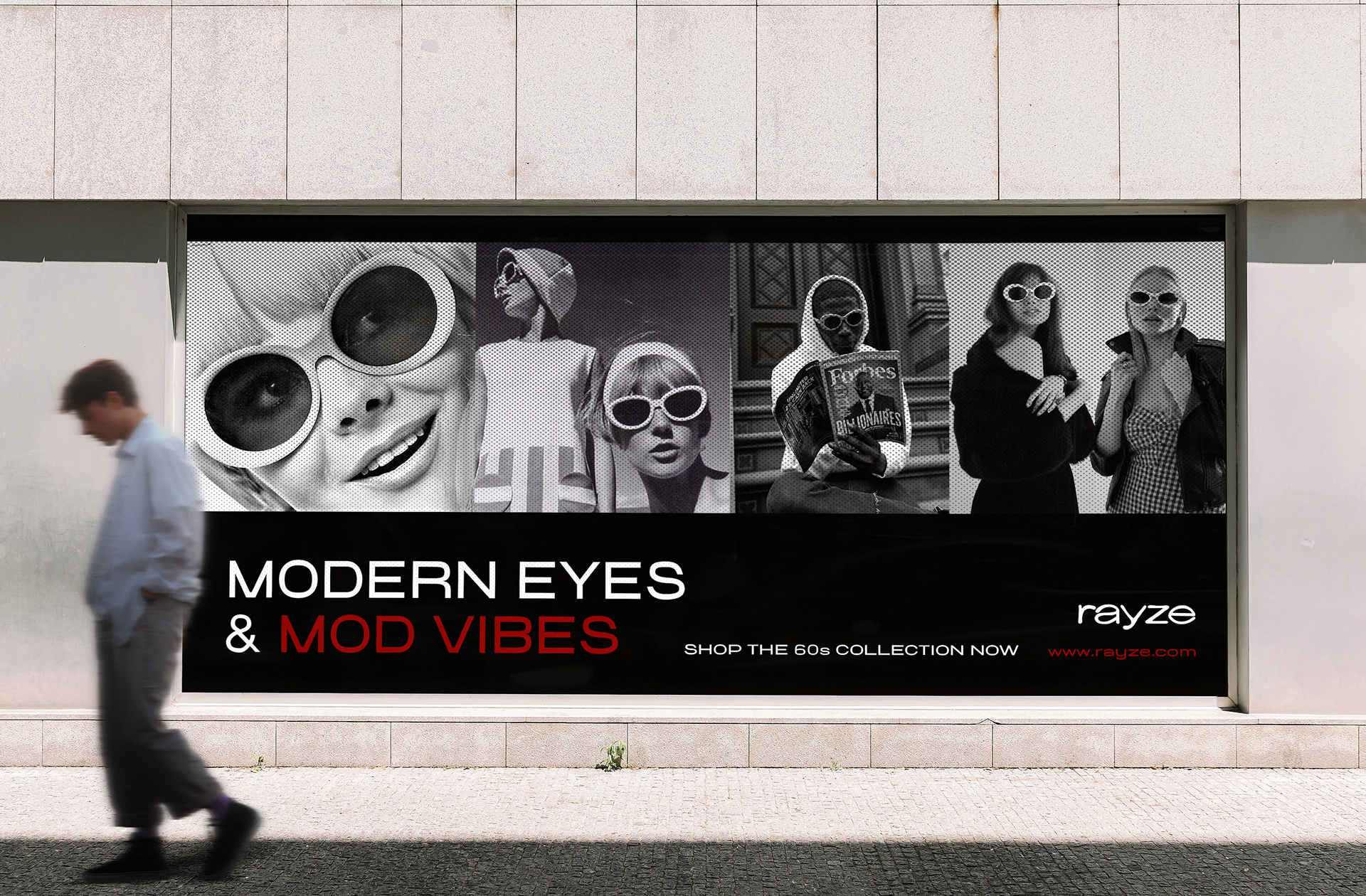
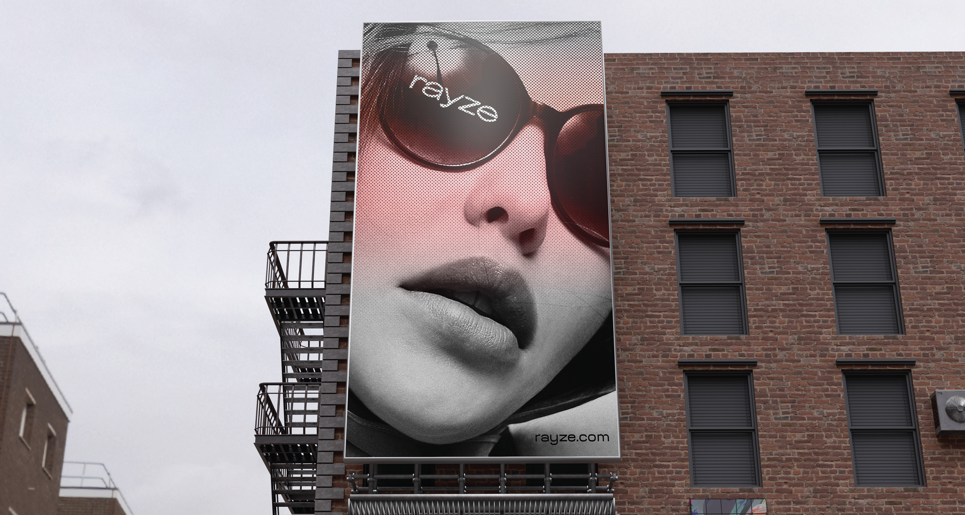
The goal of this project was to create a fashion brand. I chose to create a curated-vintage sunglass company that celebrates genuine craftsmanship and pays respect to history/craftsmanship. The purpose of the brand is to offer the fashion industry specialized vintage sunglasses that encourage people to rediscover classic styles. The brand invites a new generation to embrace timeless designs and have fun expressing themselves through fashion. The brand wants its consumers to know that vintage isn't just a look, it's a feeling.
Process Work
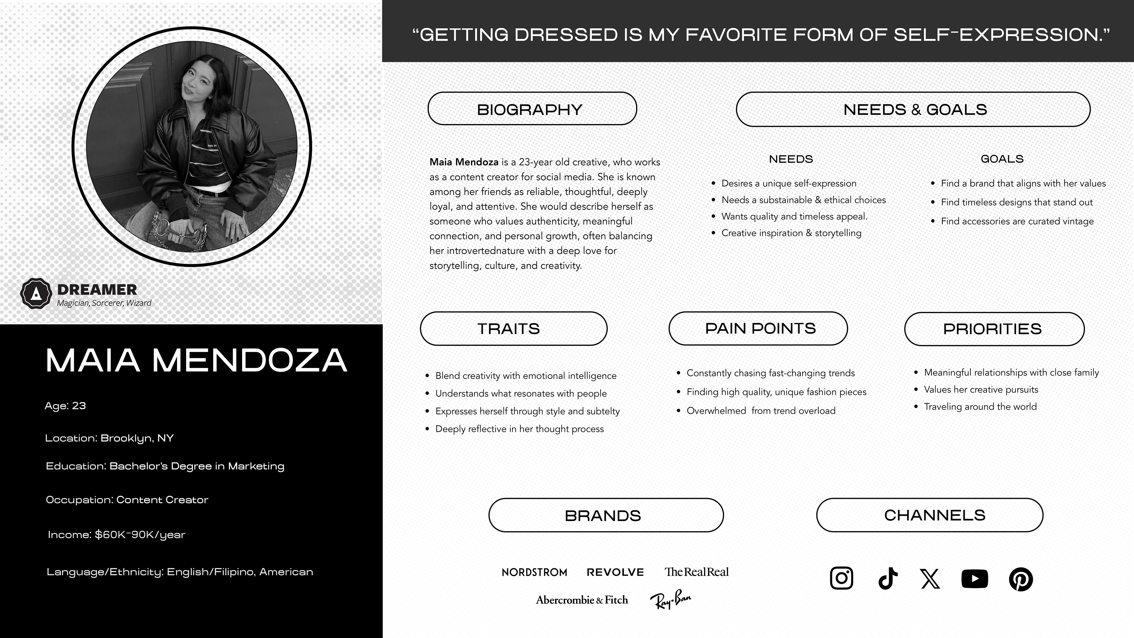
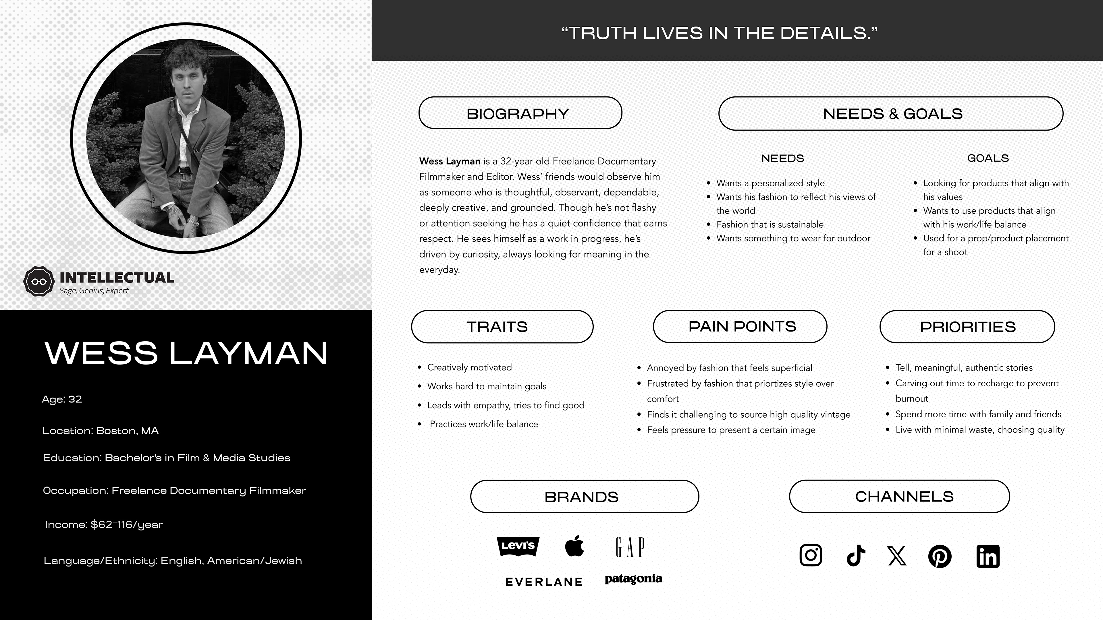
Persona Profiles
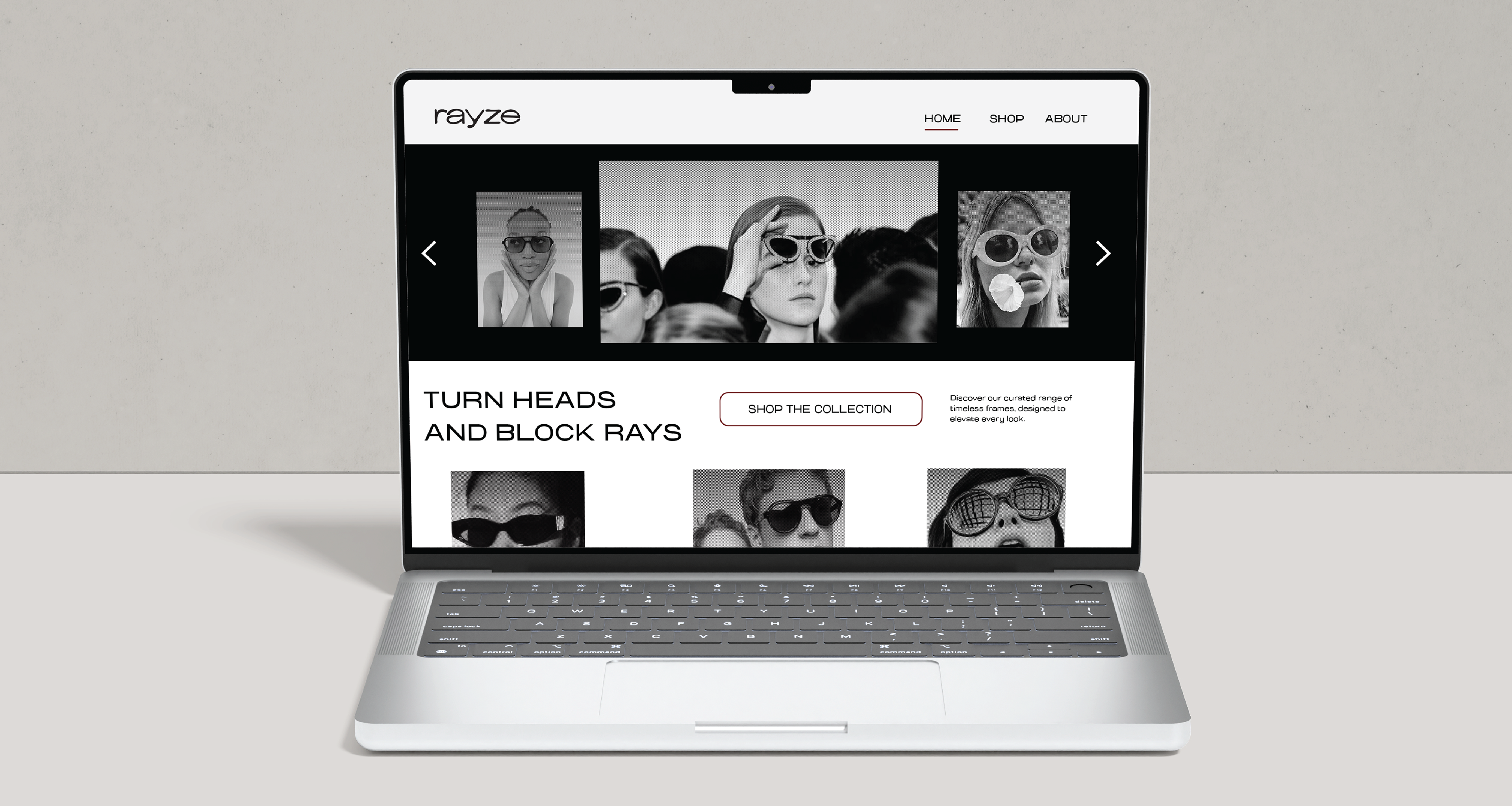
The target audience of the sunglass brand is designed for fashion-forward males and females in their 20-30s who appreciate timeless style and have a keen eye for vintage-inspired pieces. This generation has a unique ability to revive classic looks from the past and transform them into today’s must-have trends.
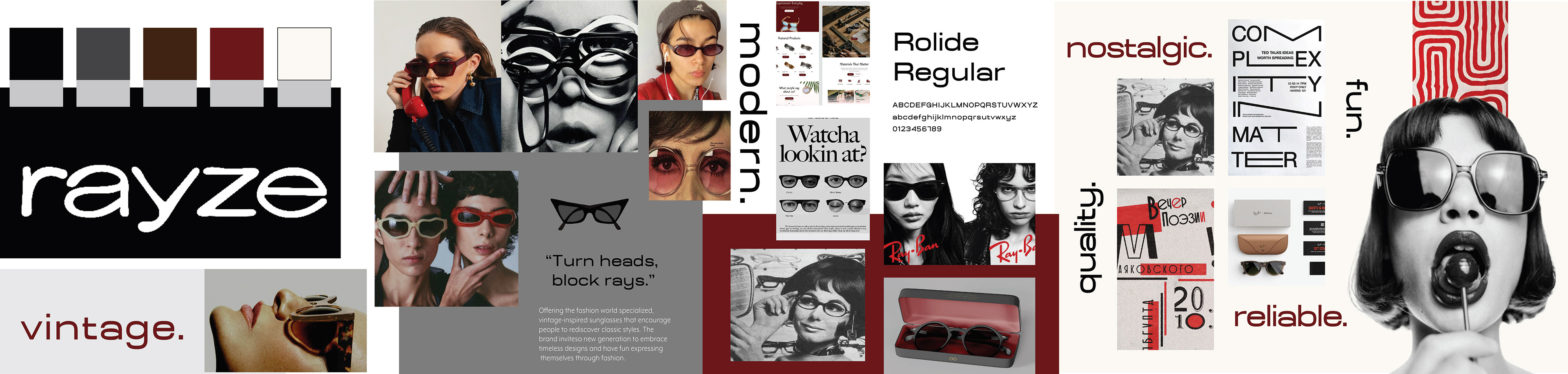
Visual Research
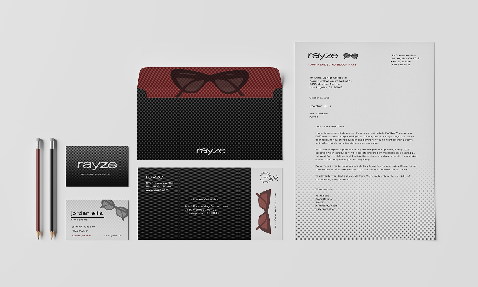
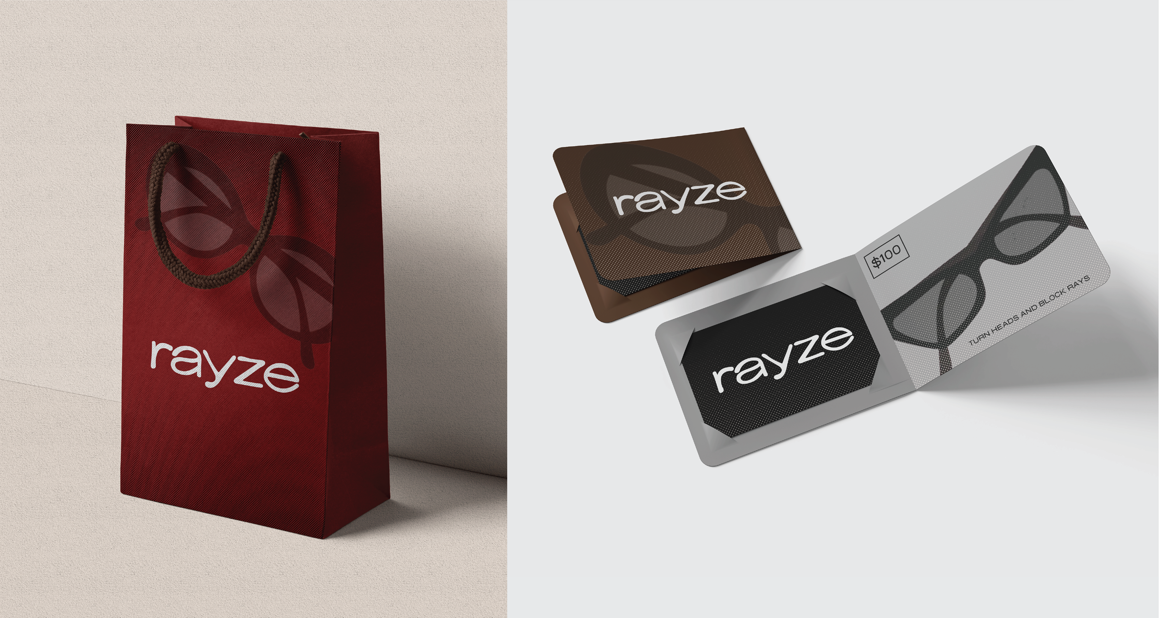
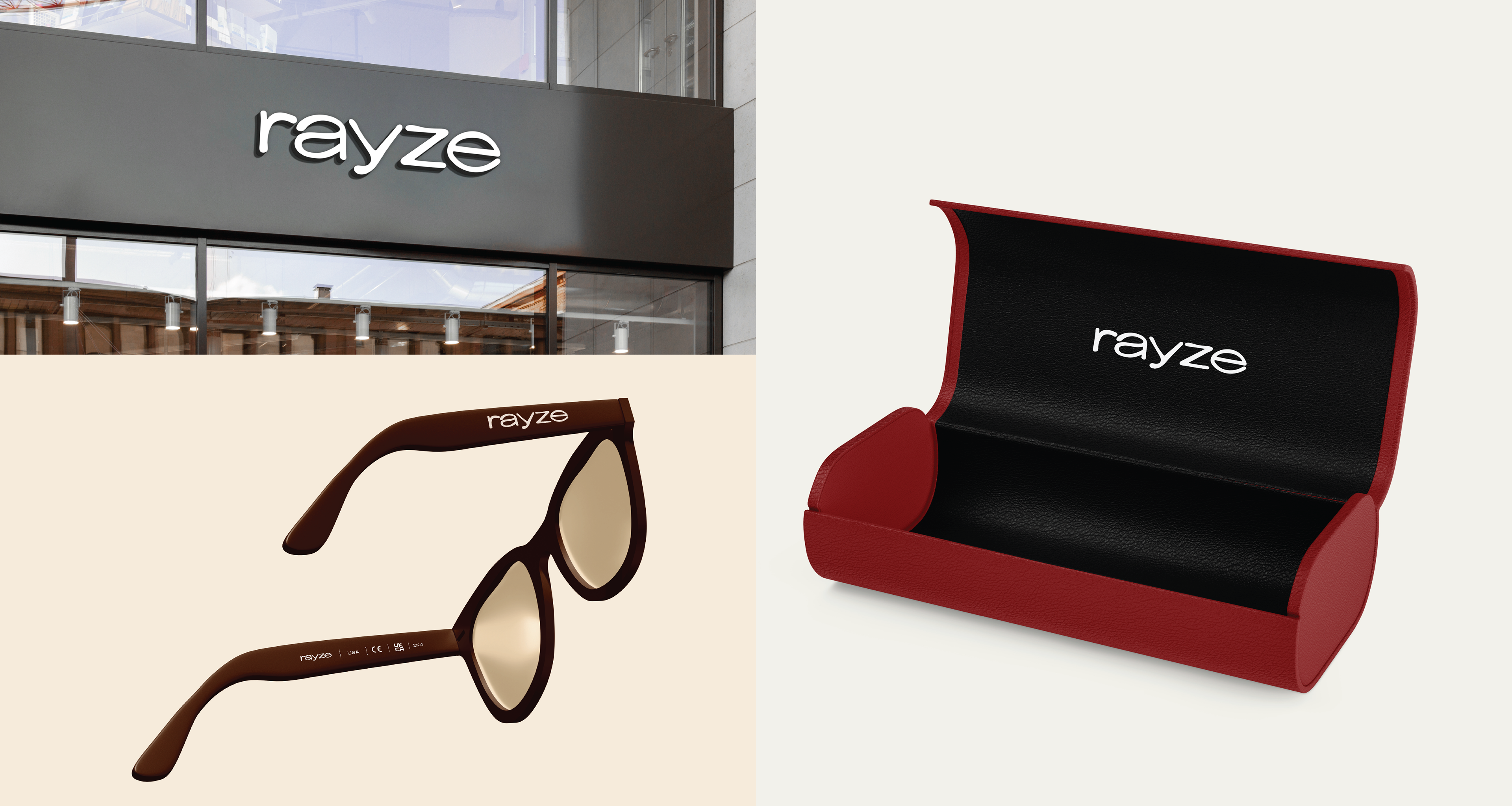
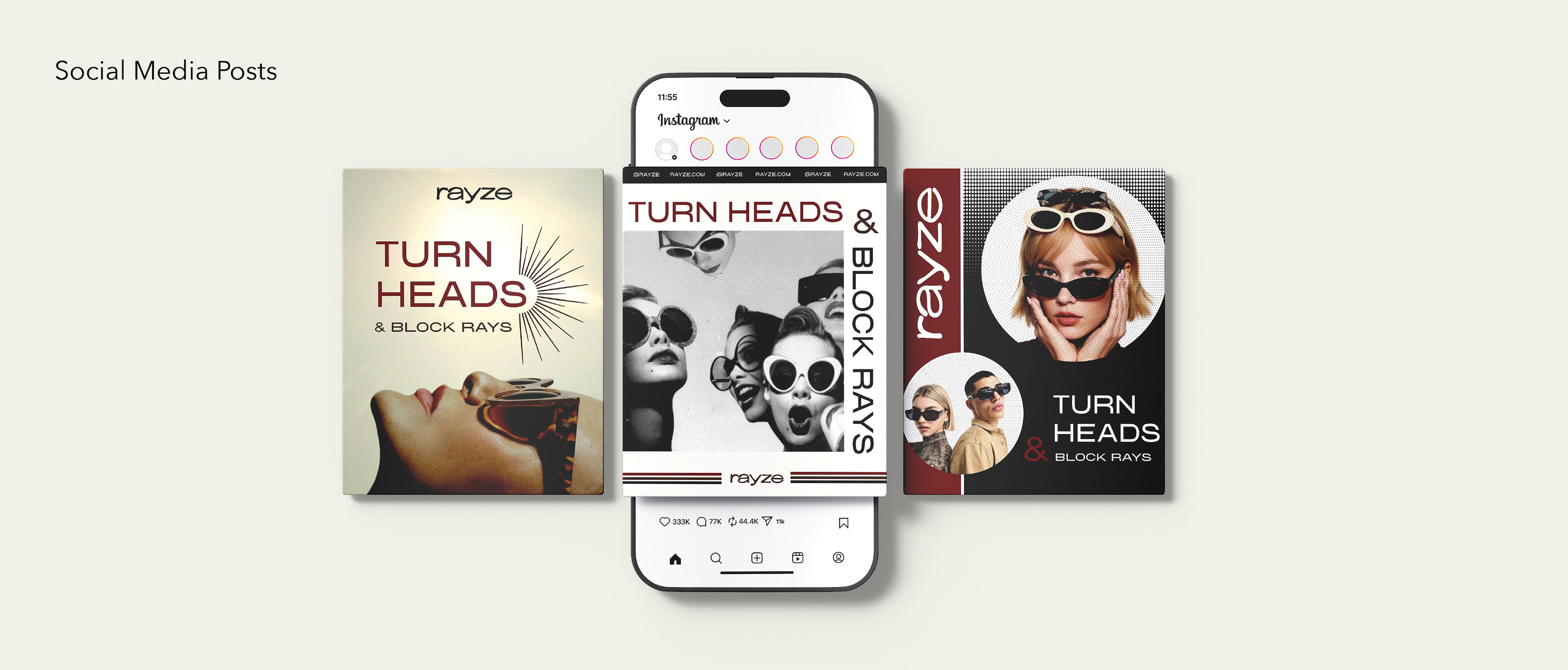
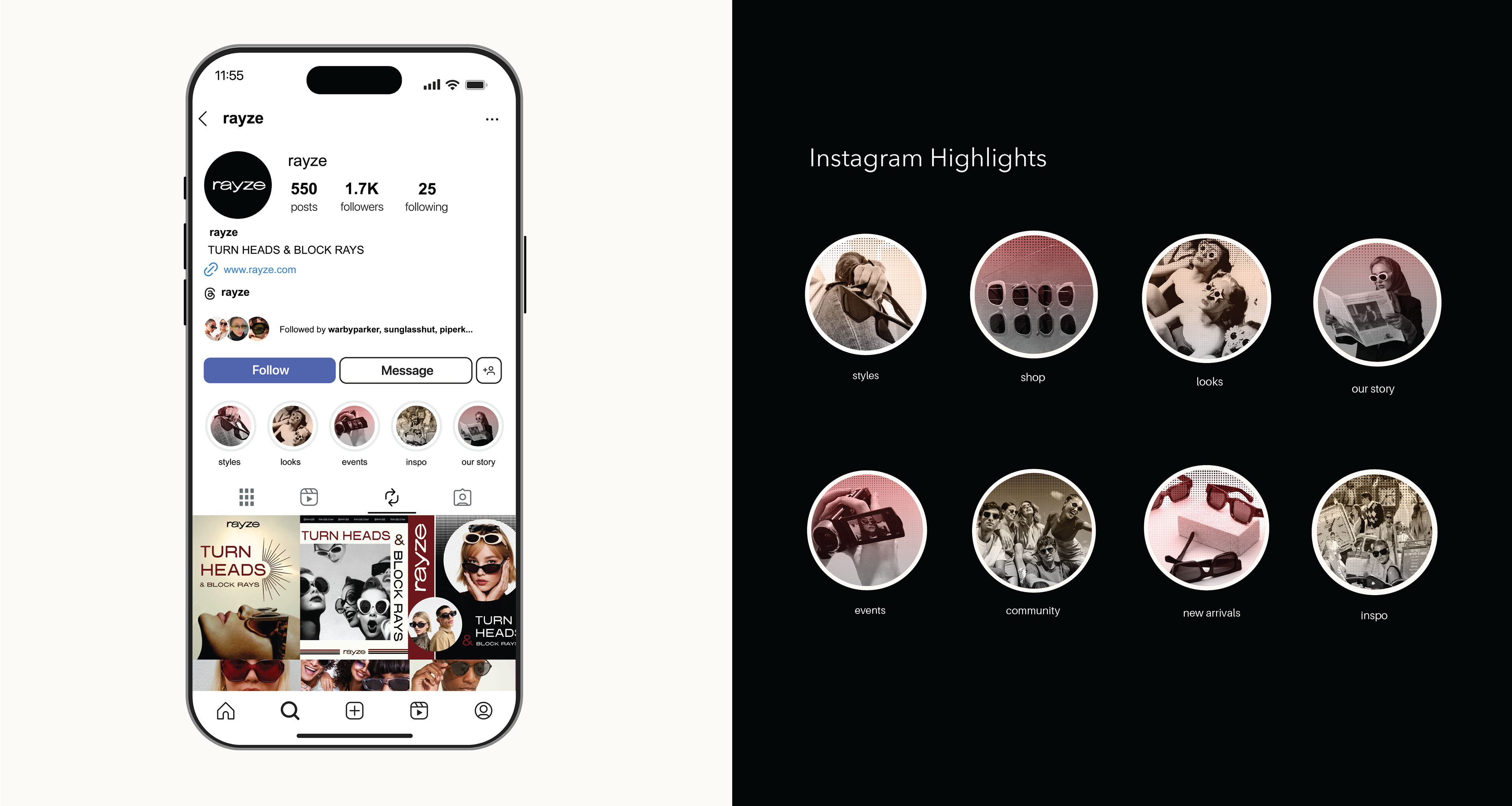
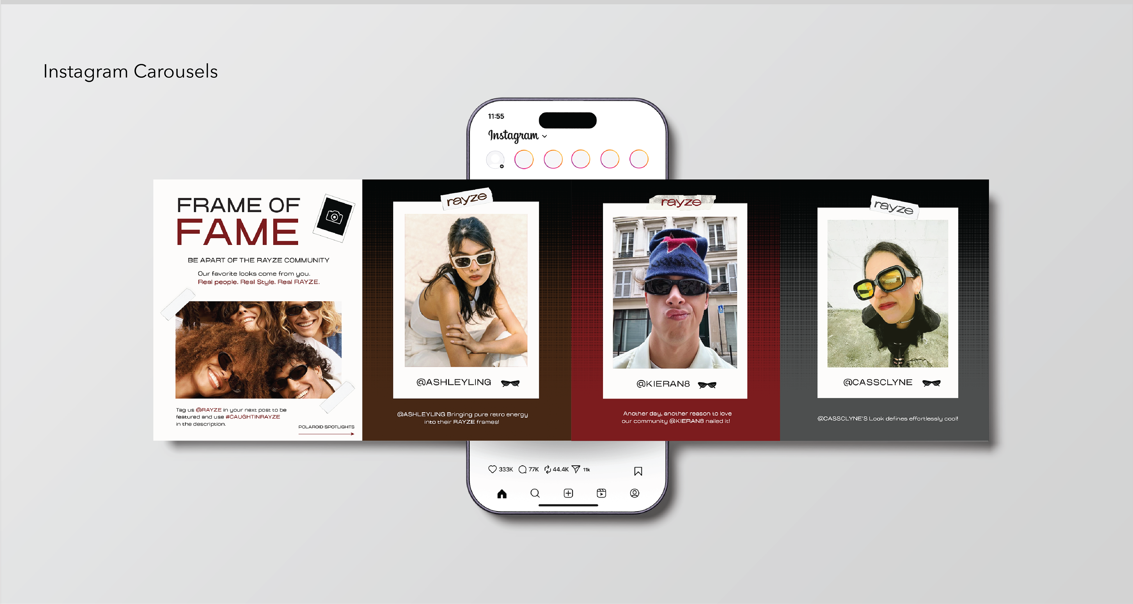
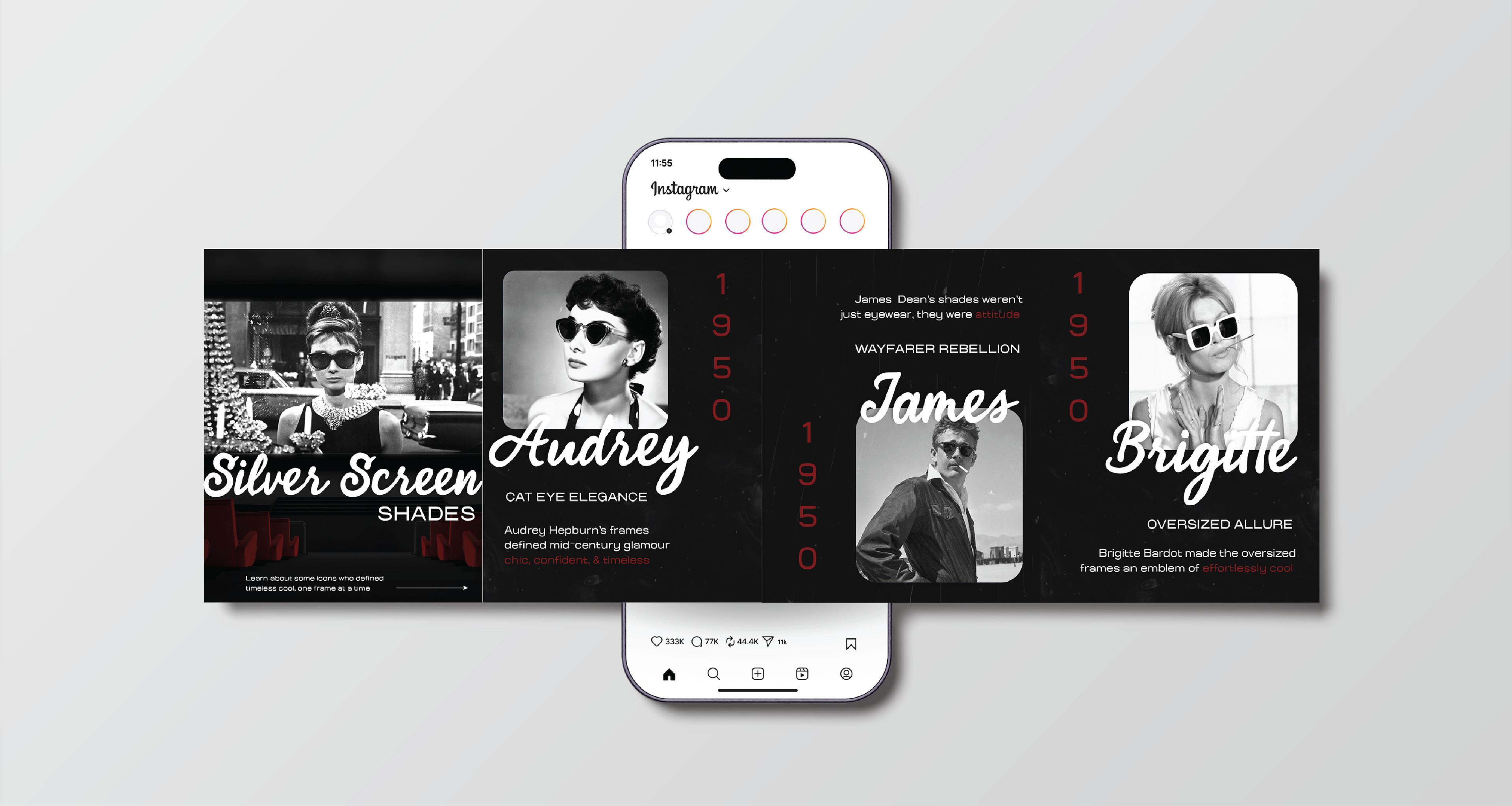
My visual research is inspired by vintage eyewear culture, editorial fashion photography, and retro graphic design, creating a visual identity that balances nostalgia with modernity. Classic sunglass silhouettes and archival advertising influence the bold imagery and expressive portraits, reinforcing the brand’s emphasis on individuality and statement-making design. A muted palette of neutrals, deep reds, and soft creams establishes a timeless, elevated tone, while clean typography keeps the brand feeling contemporary.
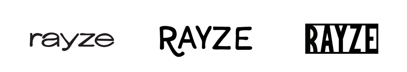
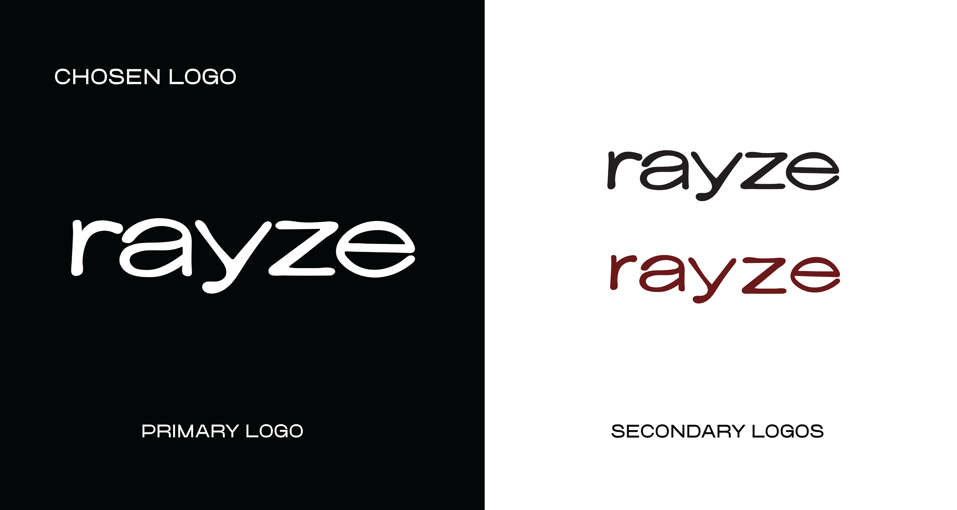
Brand Mark Process
During my logo creation, I explored a variety of hand drawn word mark and logo word mark combination sketches to capture a retro modern feel. By testing different lettering styles and adding elements like suns, waves, and sunglasses. I was able to identify the concepts that best express the brand's laid back, stylish personality.

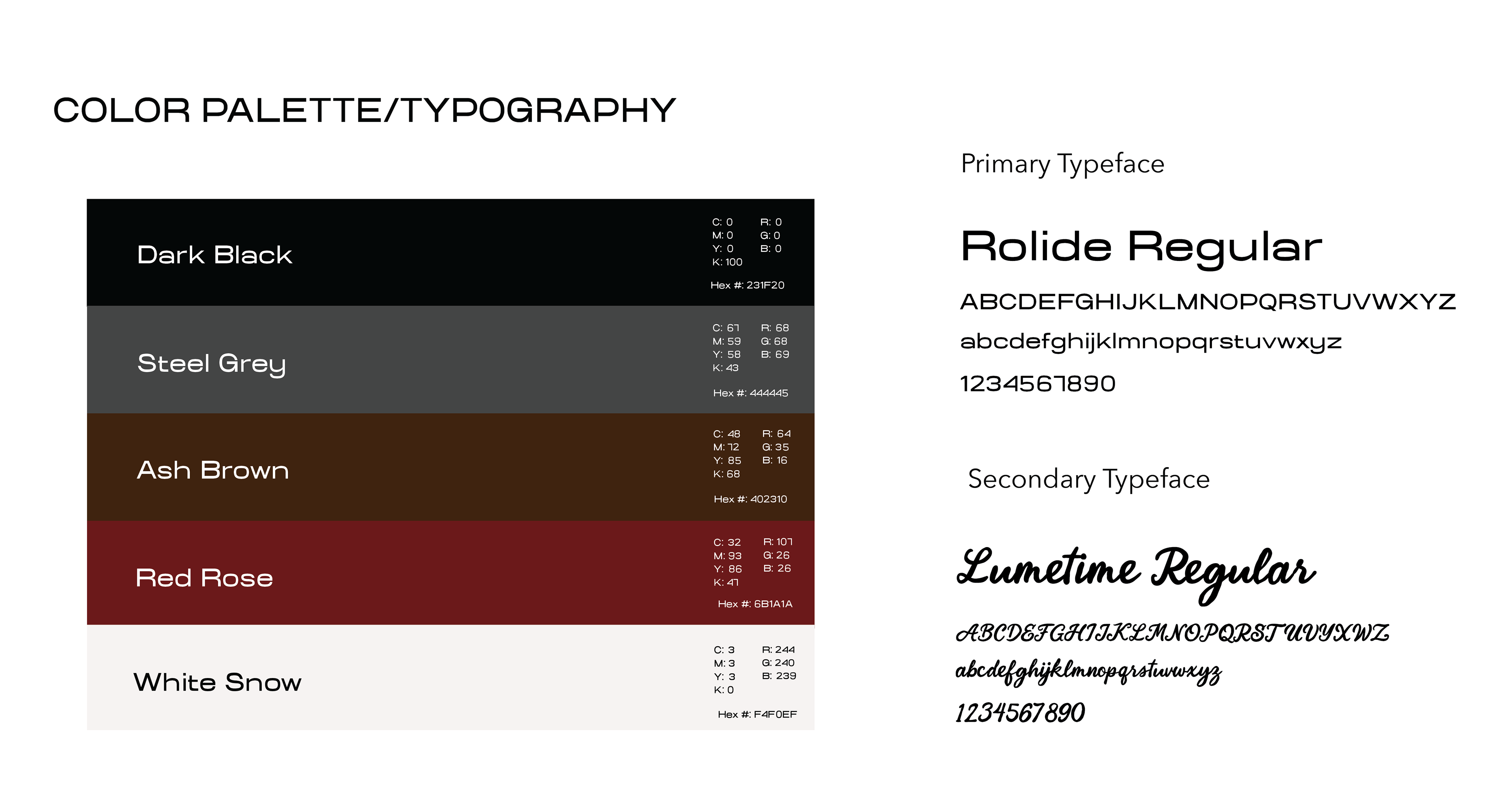
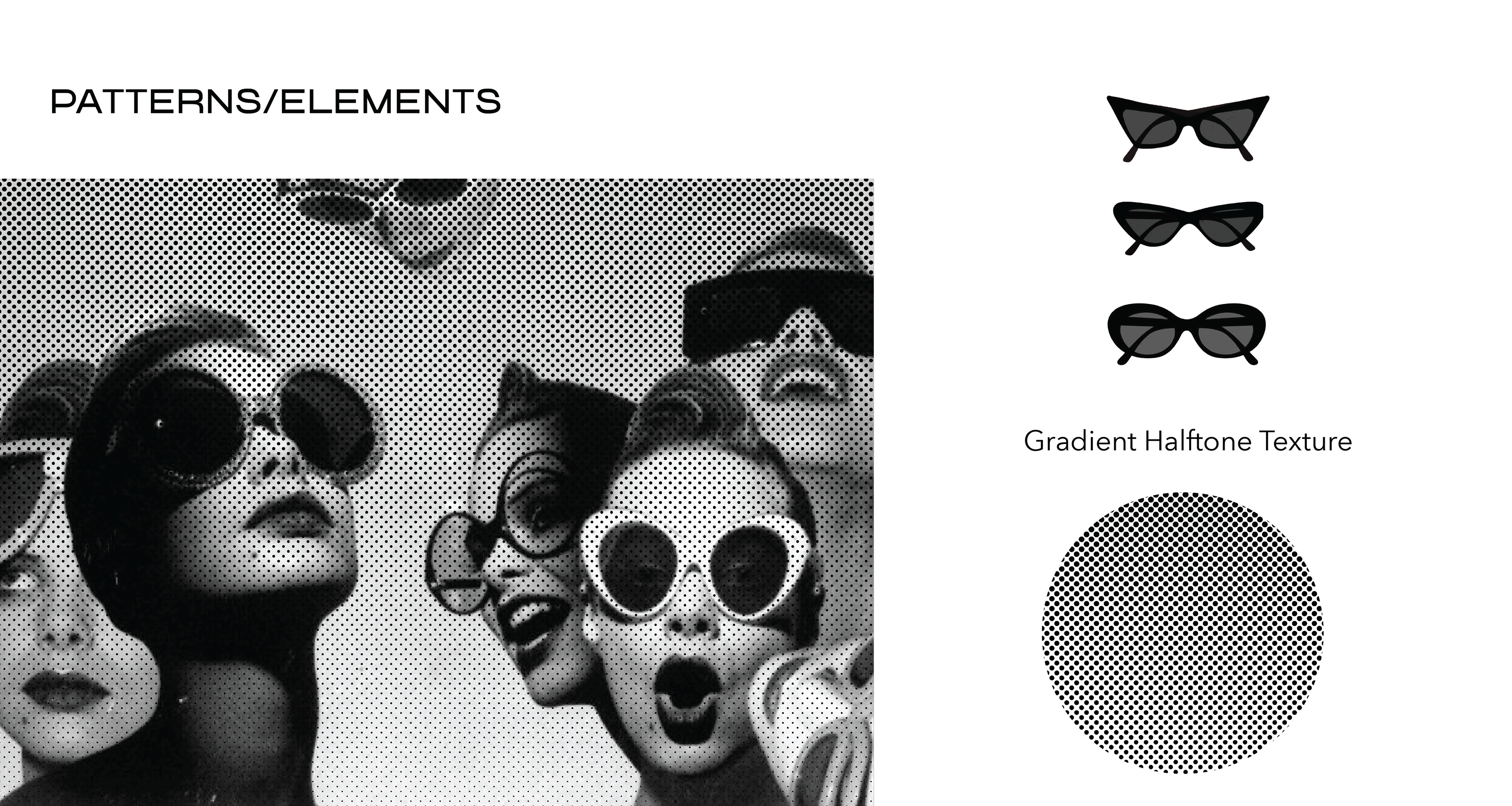
Color Palette, Typography & Pattern
The color palette is built around dark neutrals, steel greys, and warm browns, accented by deep red tones to evoke a sense of vintage sophistication and boldness. These colors reference classic eyewear materials and archival fashion imagery while maintaining a modern, elevated feel. The use of halftone and gradient textures draws from retro print techniques, reinforcing the brand’s nostalgic influence. Paired with clean, minimal graphic elements, these patterns add visual depth while keeping the overall identity refined and intentional.