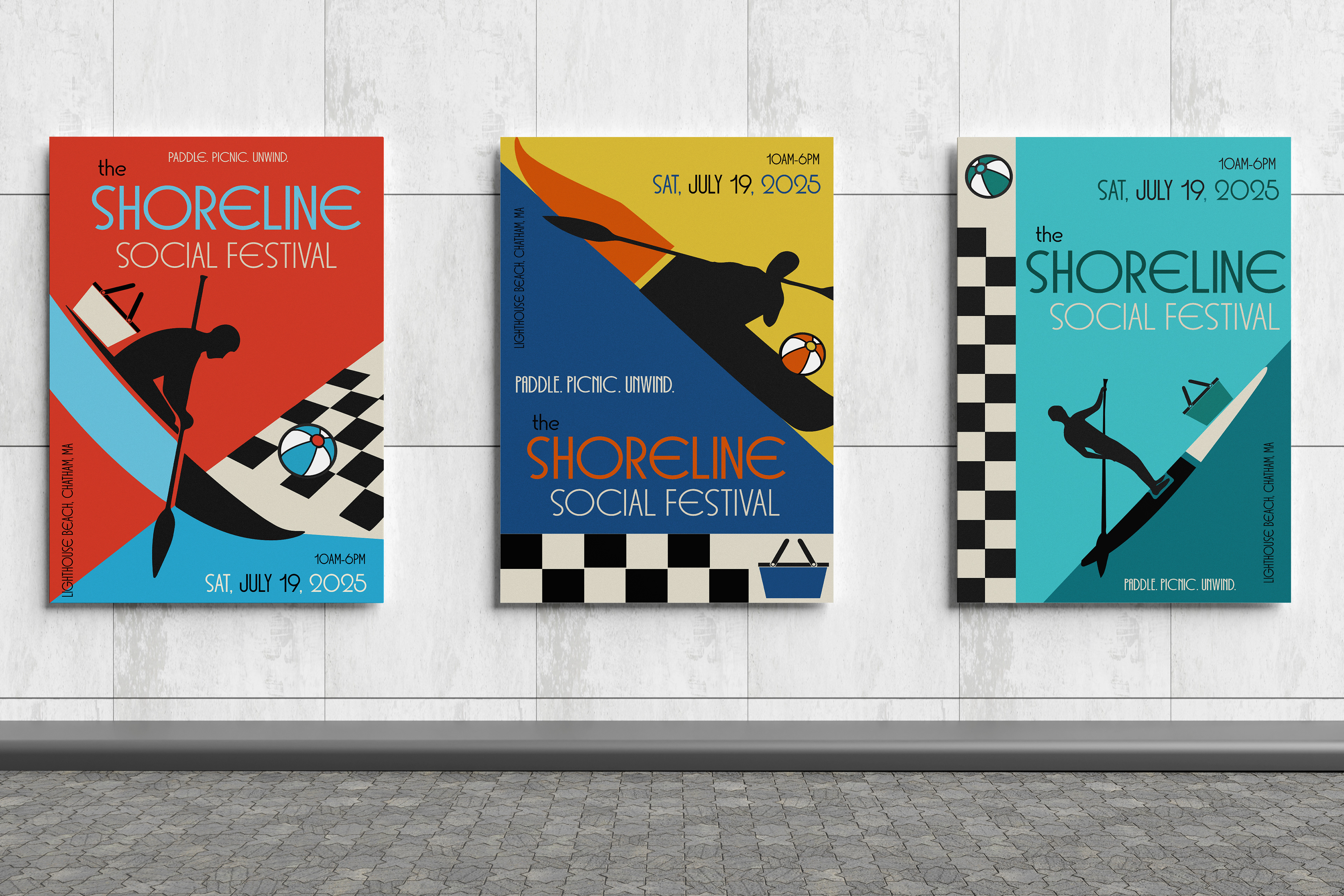
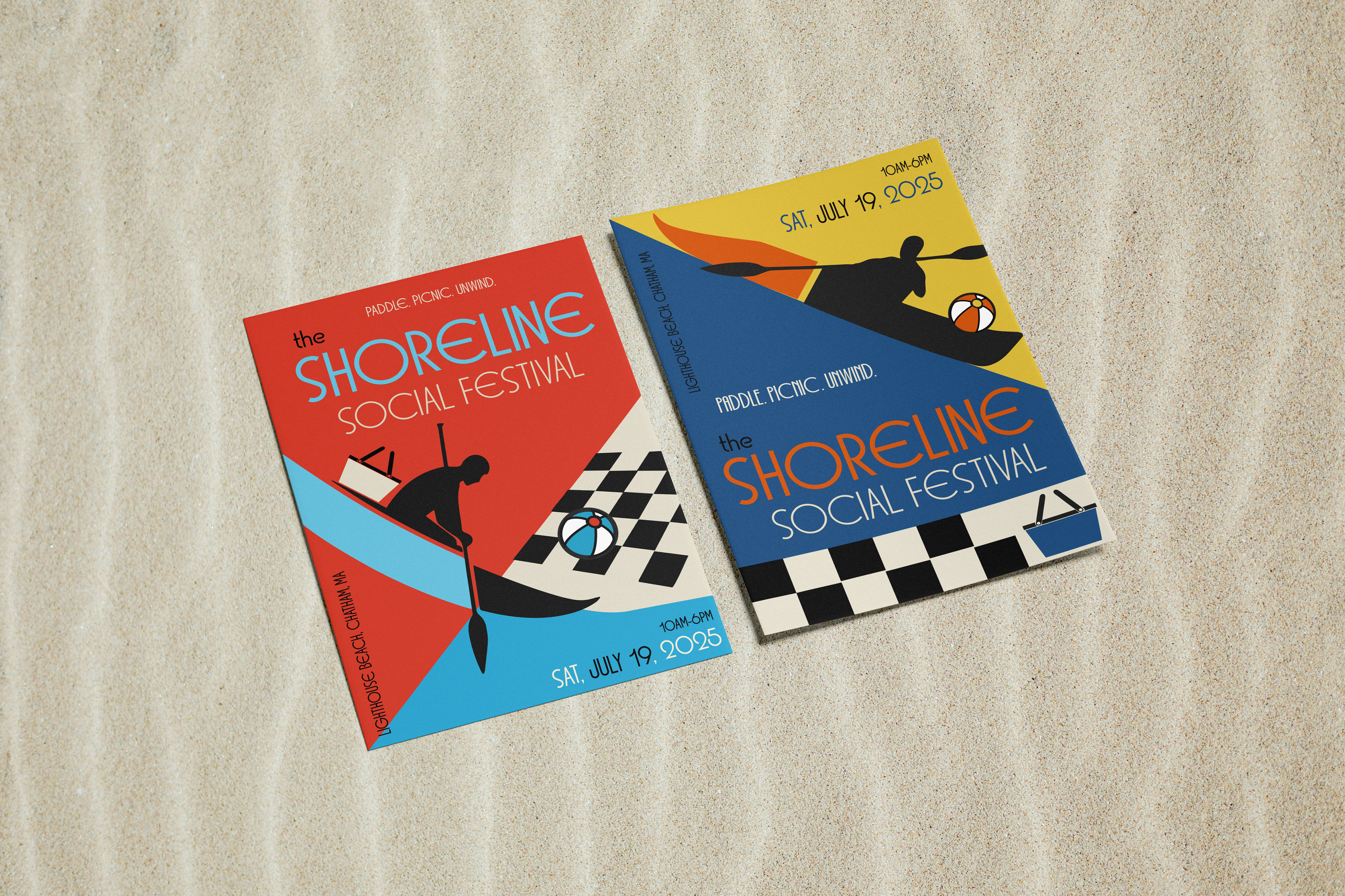
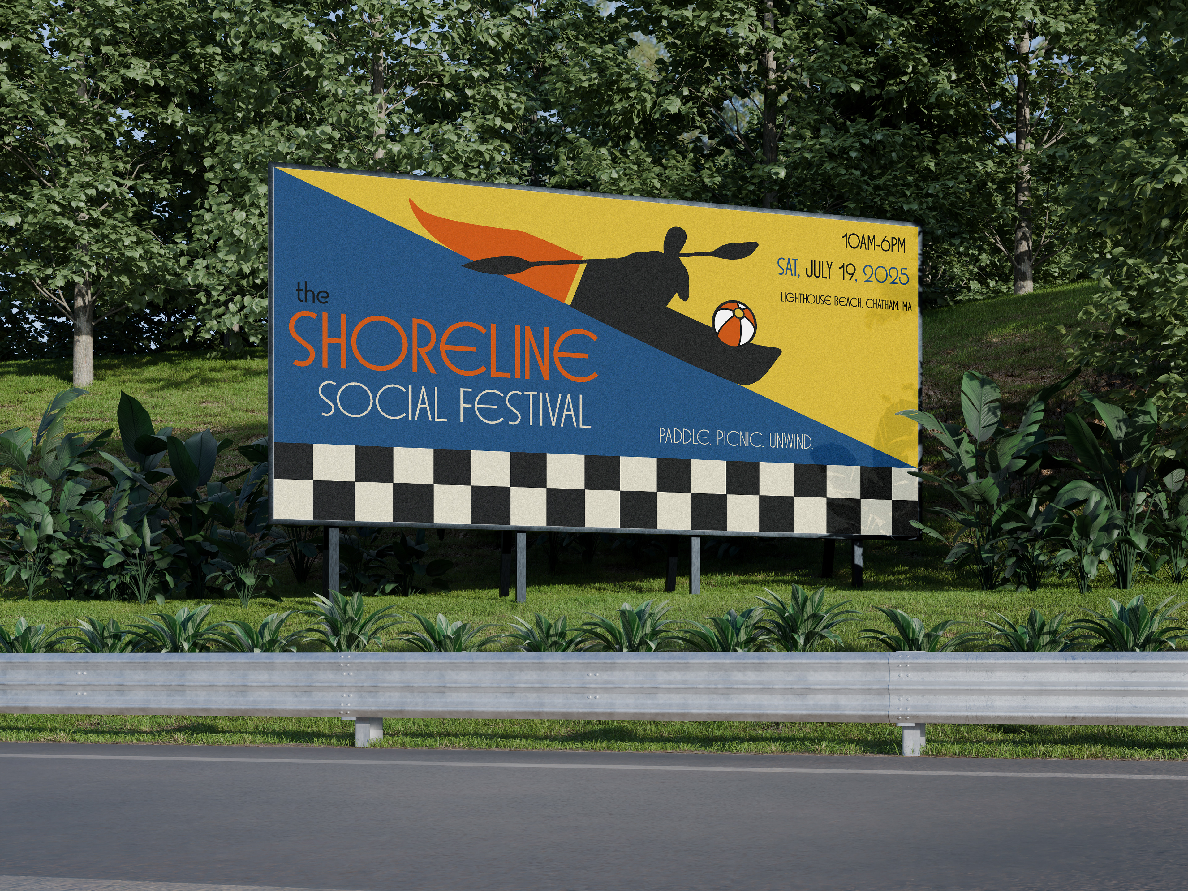
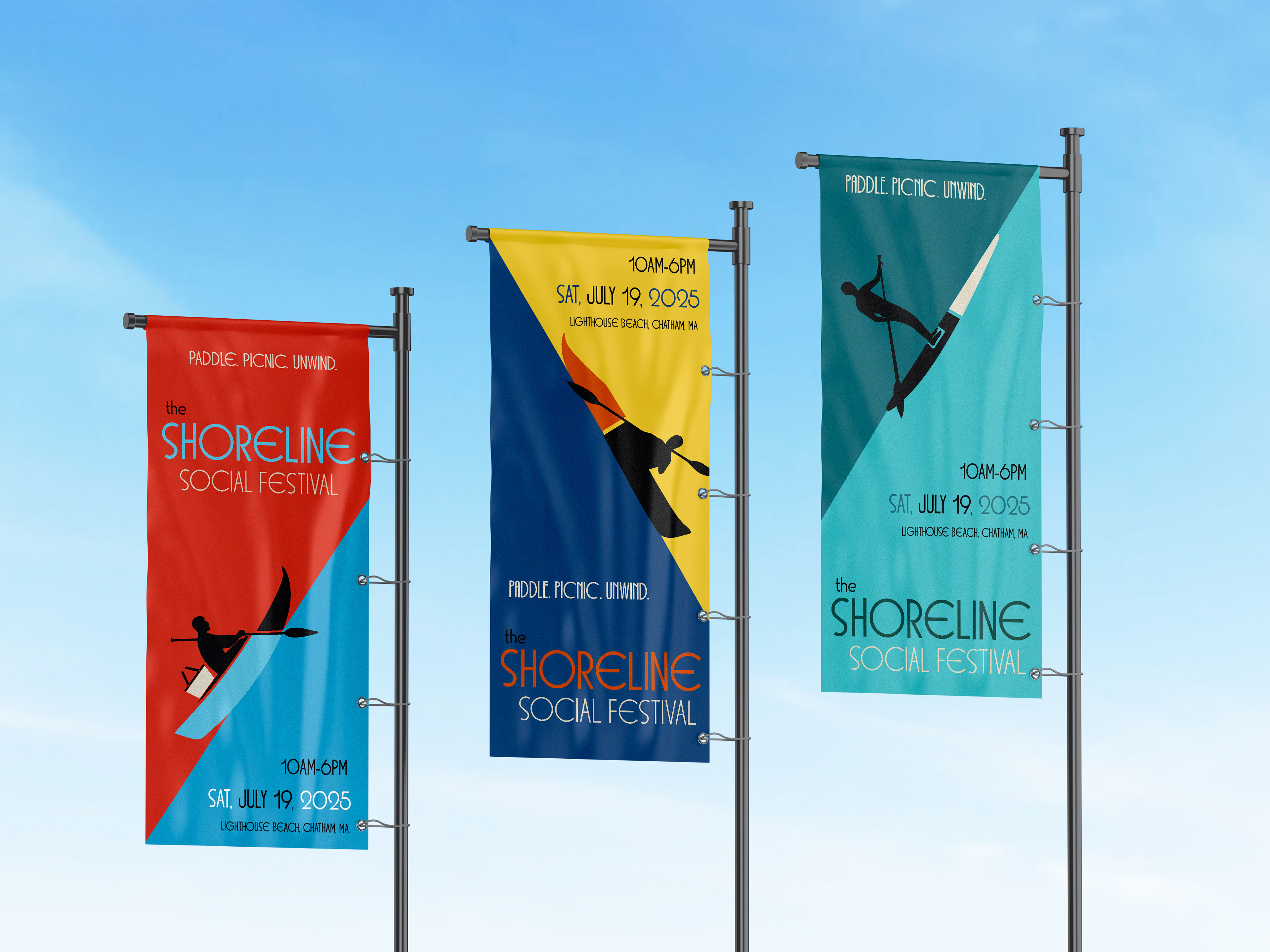
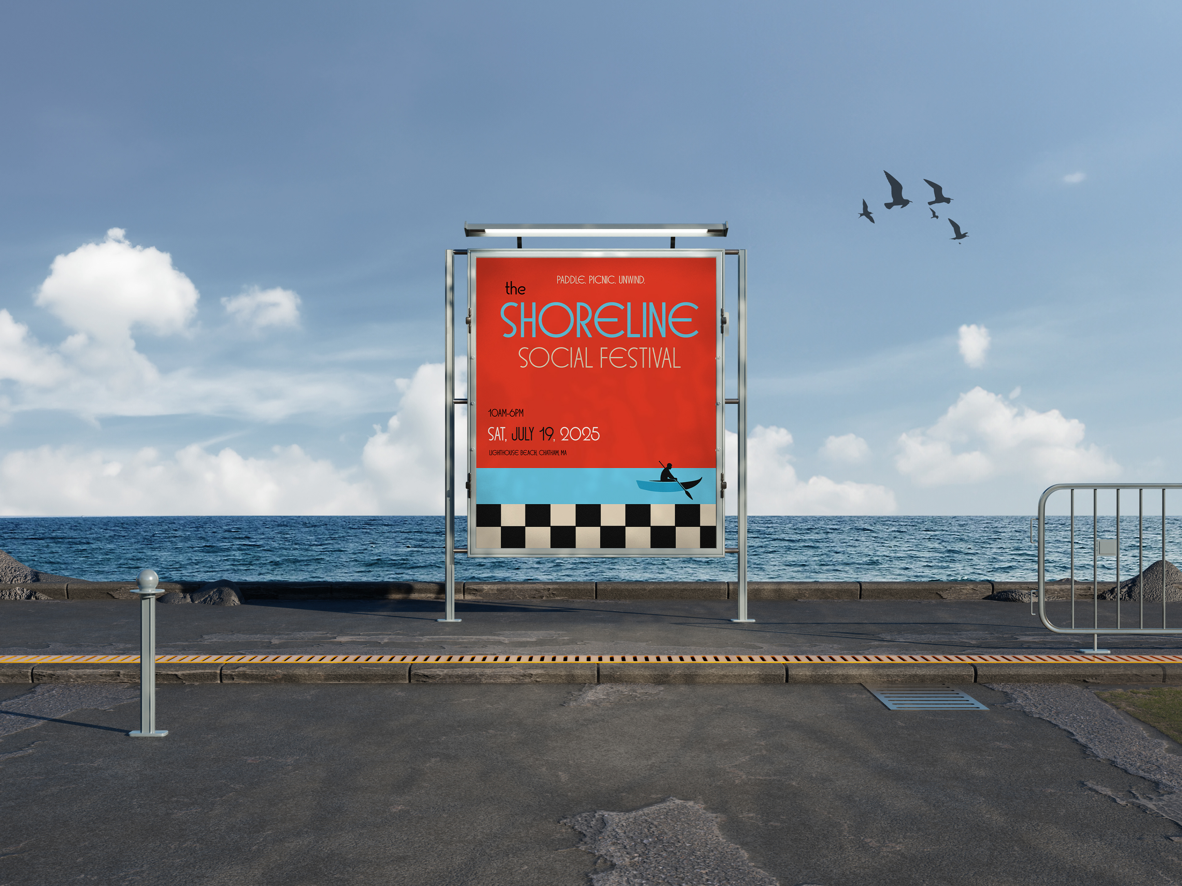
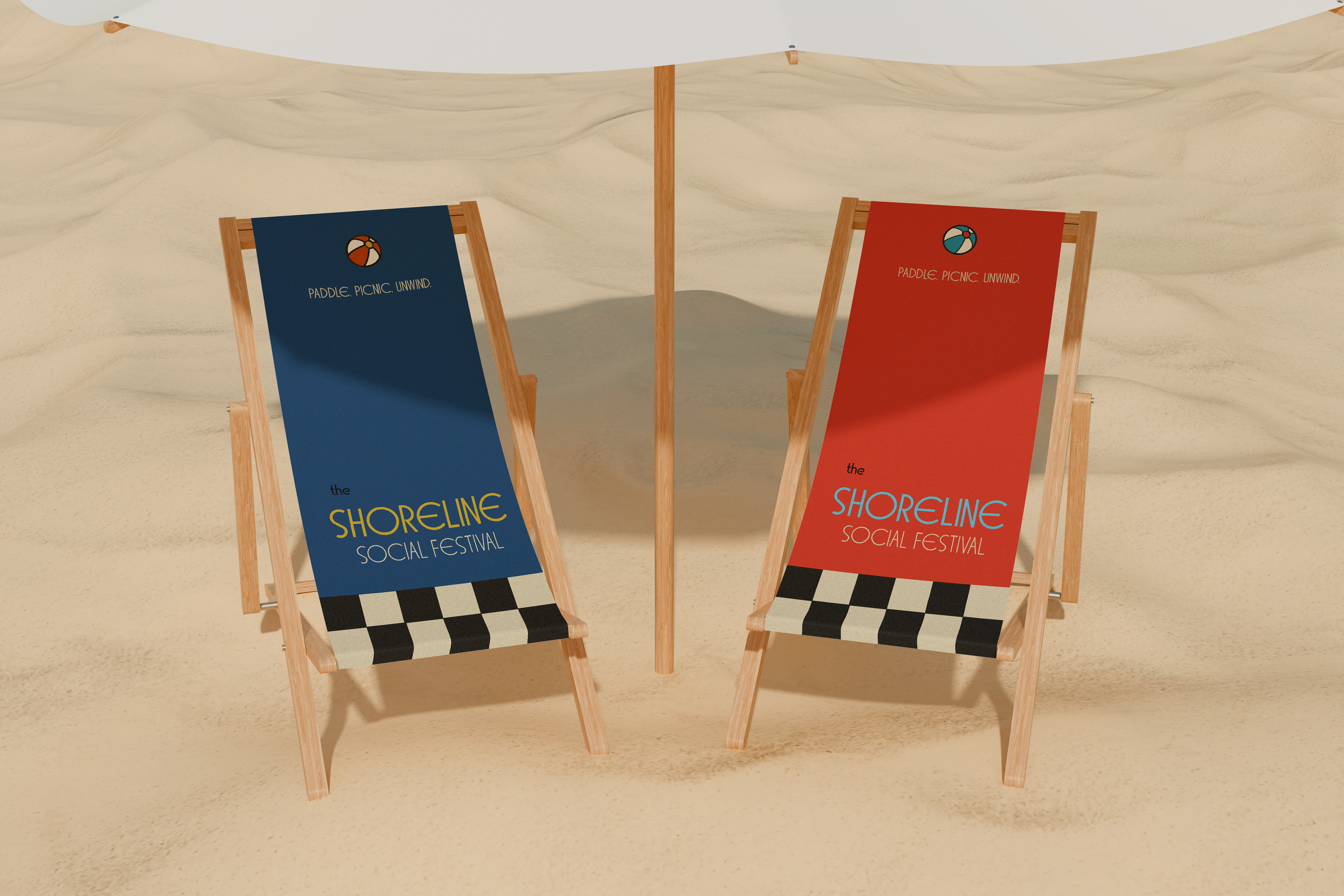
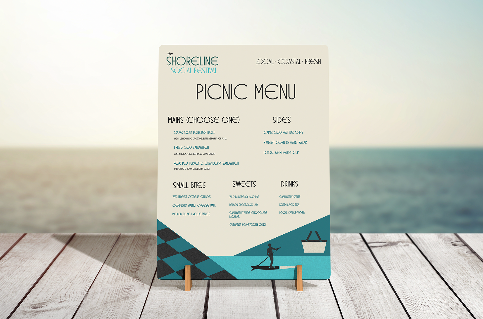
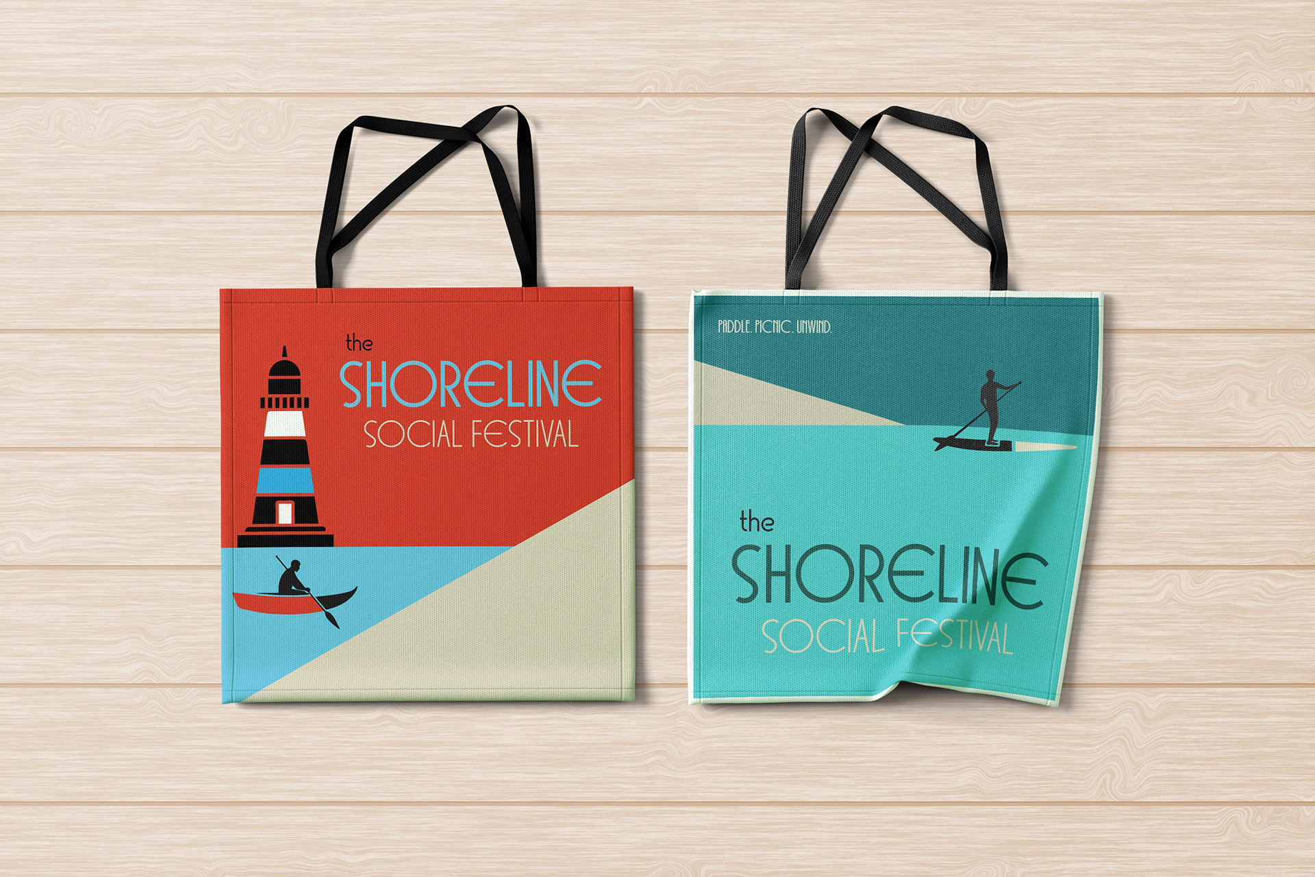
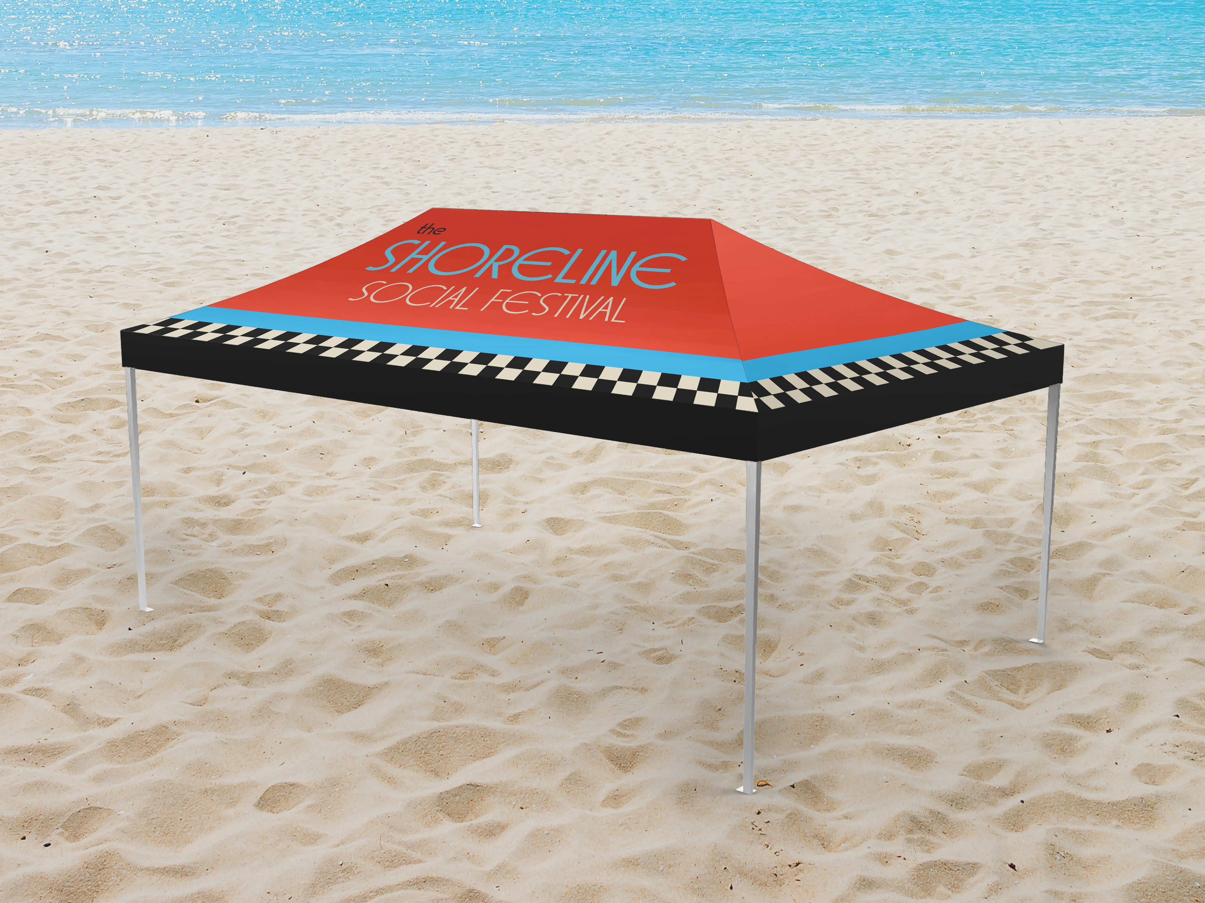
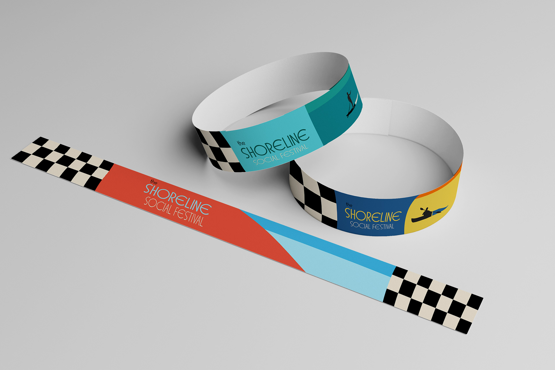
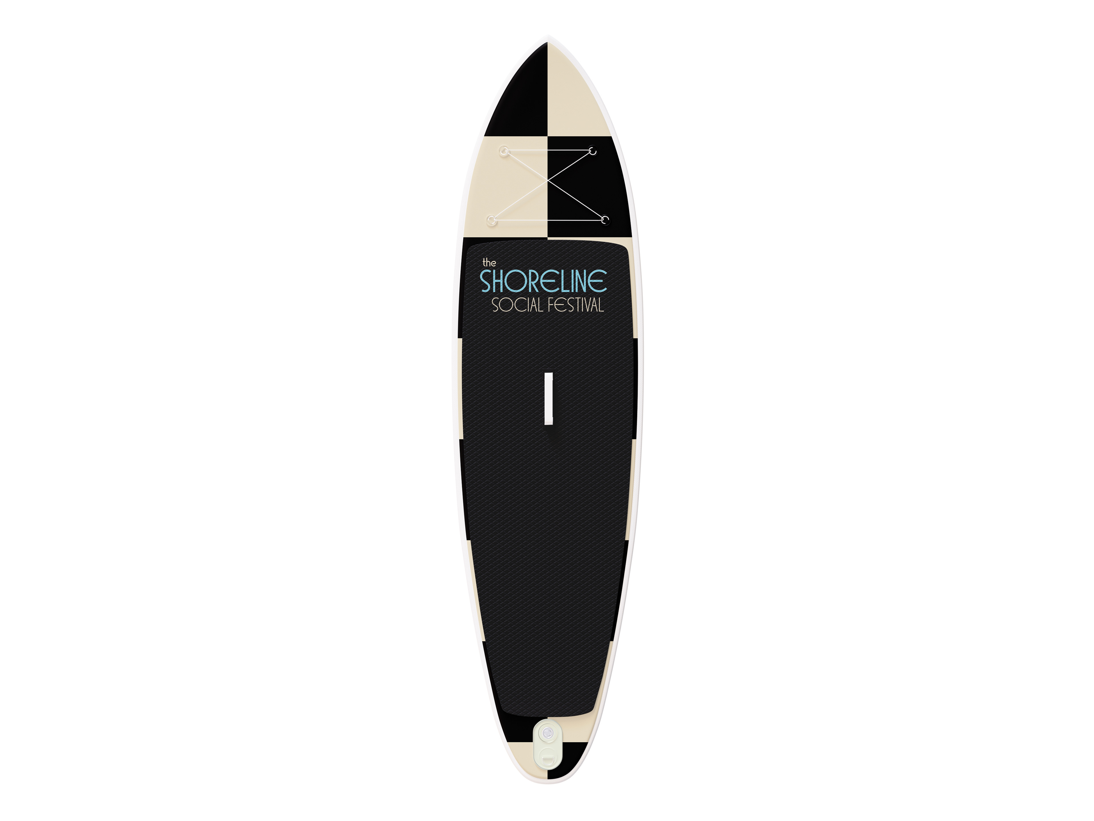
Overview
This project explores the development of a cohesive visual identity for The Shoreline Social Festival, a fictional Cape-Cod based festival set along the sands of Lighthouse Beach, MA. The goal was to create a series of poster designs that communicate the festival's relaxed welcoming coastal atmosphere while incorporating the visual language of an Art Deco influenced art movement. Through color, typography, composition, and imagery, the designs highlight the festival's emphasis on slowing down, enjoying simple shoreline pleasures, and celebrating local culture.

Process Work
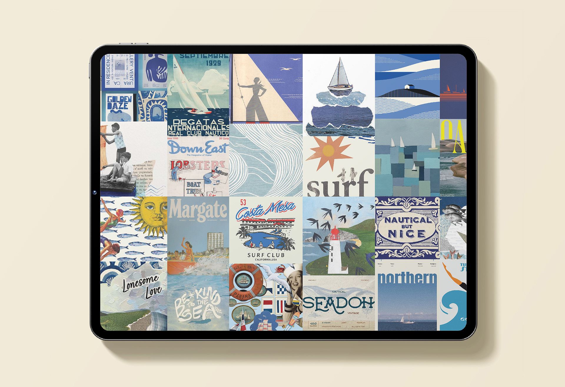
Moodboard & Researching
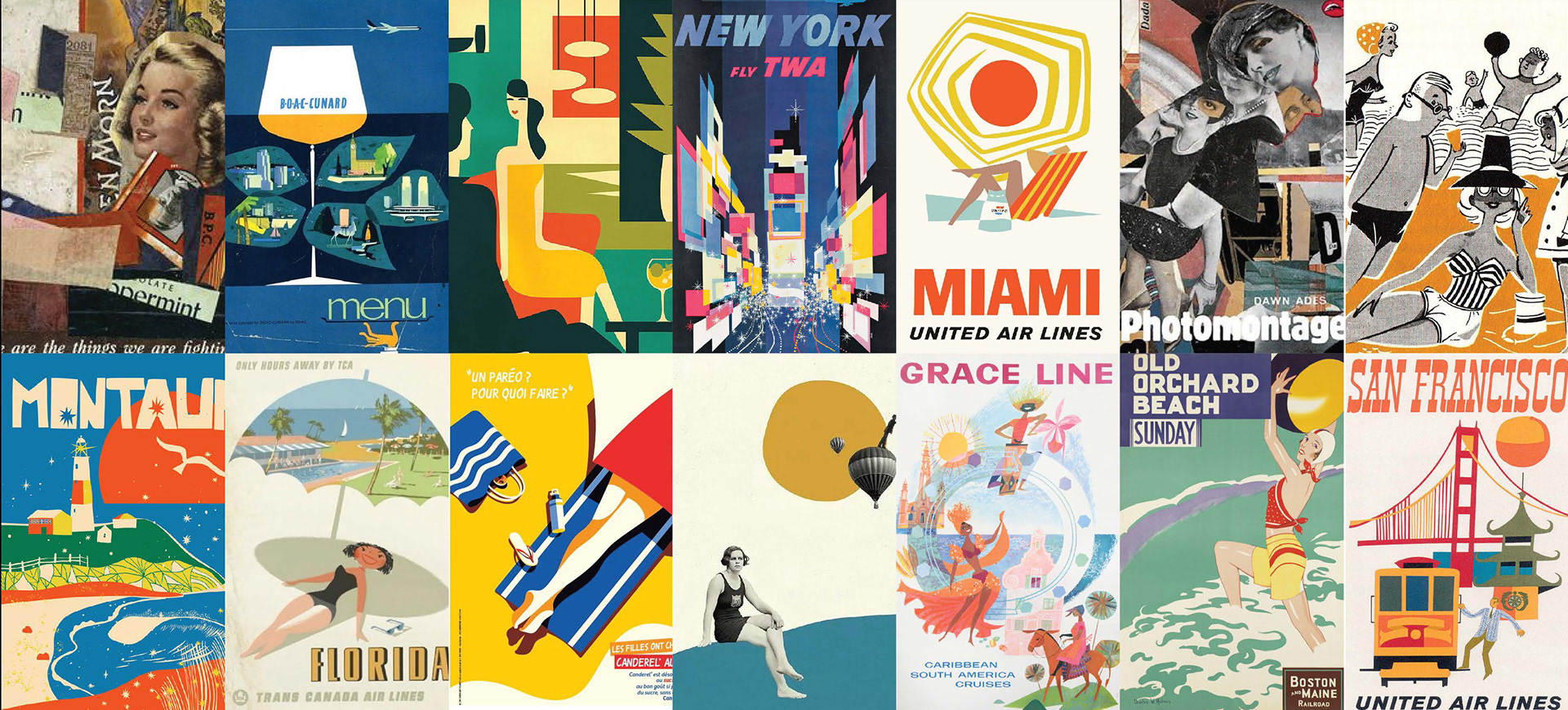
This moodboard pulls together a mix of vintage nautical posters, coastal illustrations, and retro typography to establish the visual tone for the project. It reflects a strong Art Deco and mid-century influence, shown through stylized shapes, clean geometric lines, and muted yet warm color palettes. The imagery highlights classic seaside motifs, including sailboats, waves, lighthouses, swimmers, sunbursts, and shoreline landscapes, capturing a sense of nostalgia tied to coastal travel and leisure. Overall, the moodboard sets a direction that blends seaside nostalgia with a light, airy, and inviting atmosphere, perfectly aligning with the festival's emphasis on relaxation, beach activities, and classic coastal character.
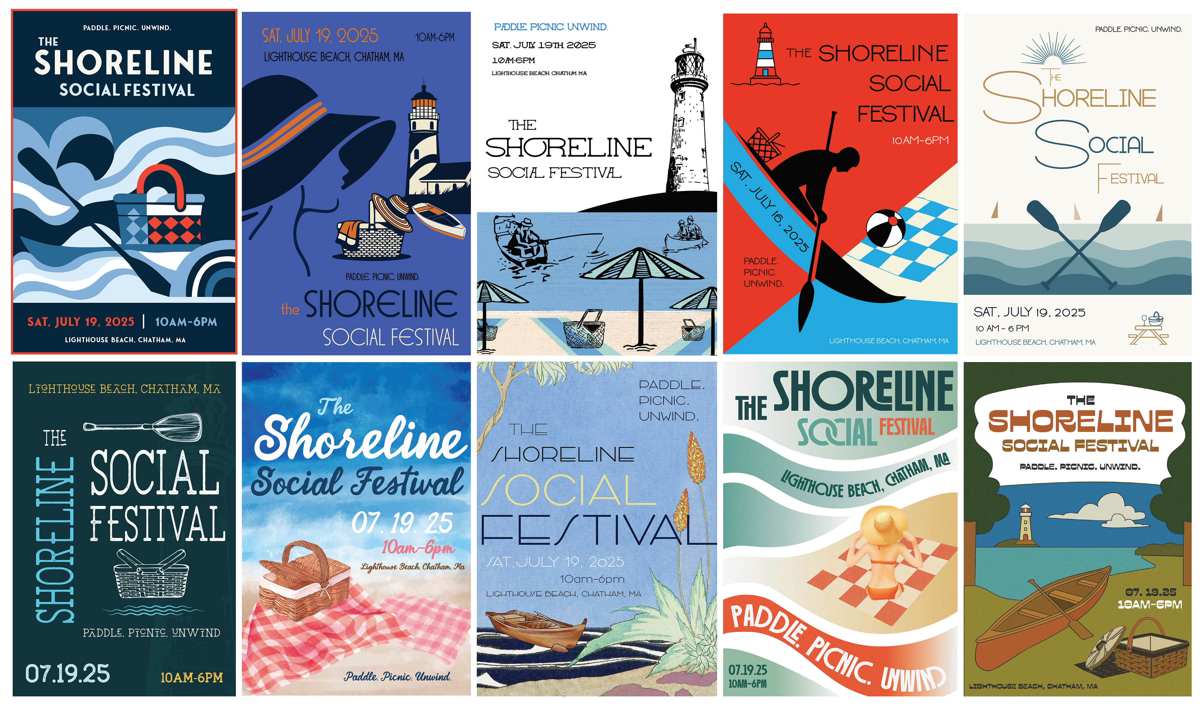
Poster Iterations
In the ideations stage, I developed a wide range of poster concepts to explore different visual directions for the festival. Each design experiments with a unique combination of layout, illustration style, and typography, allowing me to test the coastal theme and Art Deco influences could be interpreted in multiple ways. My goal was to ensure that no two posters felt the same, each variation highlights a different aspect of the festival, from relaxation and shoreline scenery to nautical charm and local Cape Cod culture. This exploration helped me narrow down which visual elements best communicate the festival's identity.
Color & Typography
I used the variable typeface BD Orange VF, choosing it specifically for its ability to capture the clean geometry and refined character often associated with Art Deco minimalism. The typeface's elongated forms, sharp angles, and subtle decorative qualities helped reinforce the vintage inspired direction of the posters while still feeling modern and flexible. Its variable settings allowed me to adjust weight and expression across different layouts, giving each poster a slightly different tone without breaking consistency. BD Orange VF worked especially well within the coastal, retro aesthetic of the festival, supporting the balance between nostalgic period styling and a fresh, contemporary identity.
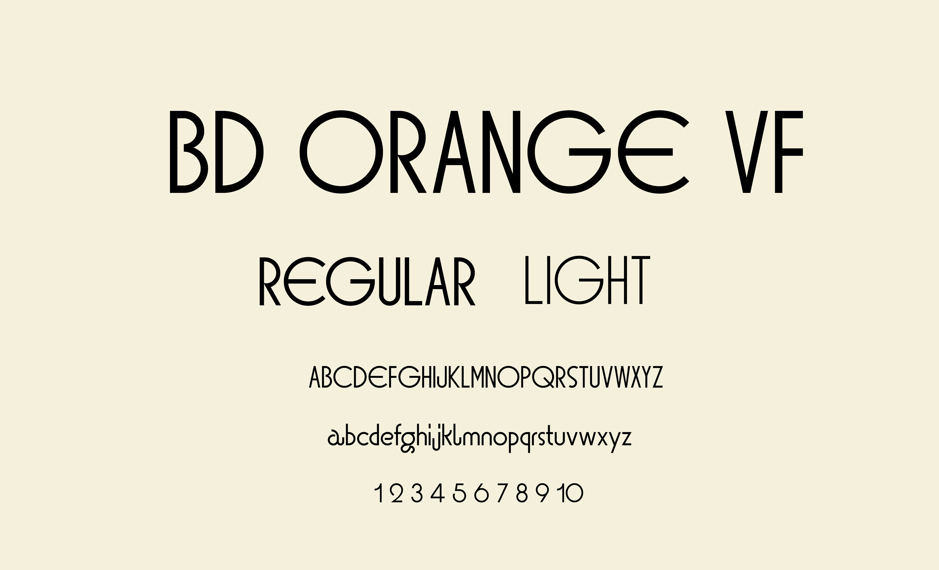
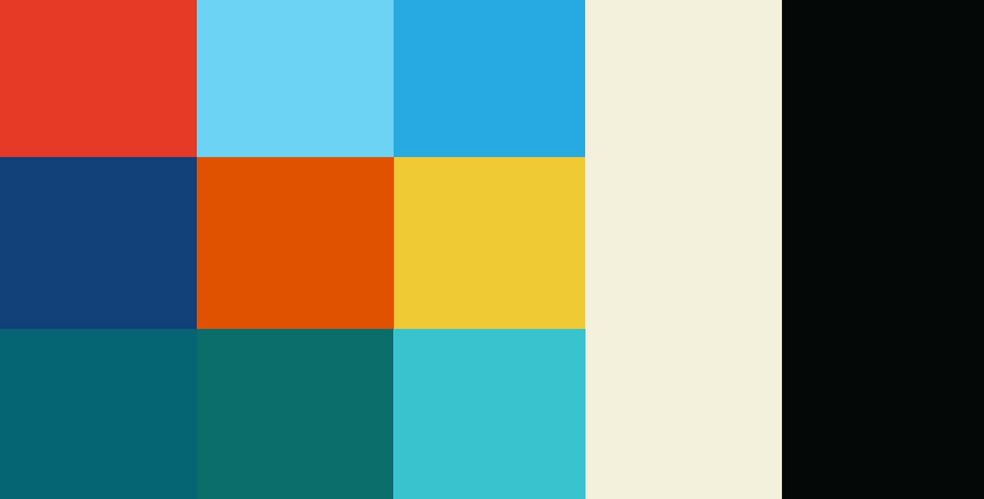
Image Style
The image style pulls from a mix of mid-century illustration, vintage collage, and bold graphic minimalism creating a look that feels both nostalgic and artful. I was aiming for a vibe that blends playful color blocking, stylized figures, and simplified shapes with a slightly retro charm. Altogether, the aesthetic is meant to feel warm, lively, and timeless, something that echoes classic leisure culture while still supporting the relaxed, summery spirit of the festival. The varied references also help keep the visual language flexible, allowing it to shift between energetic and calm moments. Overall, the style is focused, cohesive, and grounded in a vintage inspired approach that complements the festival's identity without feeling overly done.